pacman::p_load(ggdist, ggridges, ggthemes, colorspace, tidyverse)Hands-On Exercise 02
Overview
In this chapter, you will be introduced to several ggplot2 extensions for creating more elegant and effective statistical graphics. By the end of this exercise, you will be able to:
- control the placement of annotation on a graph by using functions provided in ggrepel package,
- create professional publication quality figure by using functions provided in ggthemes and hrbrthemes packages,
- plot composite figure by combining ggplot2 graphs by using patchwork package.
1 Getting Started
1.1 Loading R packages
Note: Ensure that the pacman package has already been installed.
The code chunk below uses p_load() of pacman package to load the tidyverse family of packages.
ggridges, a ggplot2 extension specially designed for plotting ridgeline plots,
ggdist, a ggplot2 extension spacially desgin for visualising distribution and uncertainty,
tidyverse, a family of R packages to meet the modern data science and visual communication needs,
ggthemes, a ggplot extension that provides the user additional themes, scales, and geoms for the ggplots package, and
colorspace, an R package provides a broad toolbox for selecting individual colors or color palettes, manipulating these colors, and employing them in various kinds of visualisations.
1.2 Importing data
For the purpose of this exercise, a data file called Exam_data will be used. It consists of year end examination grades of a cohort of primary 3 students from a local school. It is in csv file format.
The code chunk below imports exam_data.csv into R environment by using read_csv() function of readr package.
readr is one of the tidyverse package.
exam_data <- read_csv("data/Exam_data.csv")Data contains:
Year end examination grades of a cohort of primary 3 students from a local school.
There are a total of seven attributes. Four of them are categorical data type and the other three are in continuous data type.
The categorical attributes are: ID, CLASS, GENDER and RACE.
The continuous attributes are: MATHS, ENGLISH and SCIENCE.
2 Beyond ggplot2 Annotation: ggrepel
One of the challenge in plotting statistical graph is annotation, especially with large number of data points.
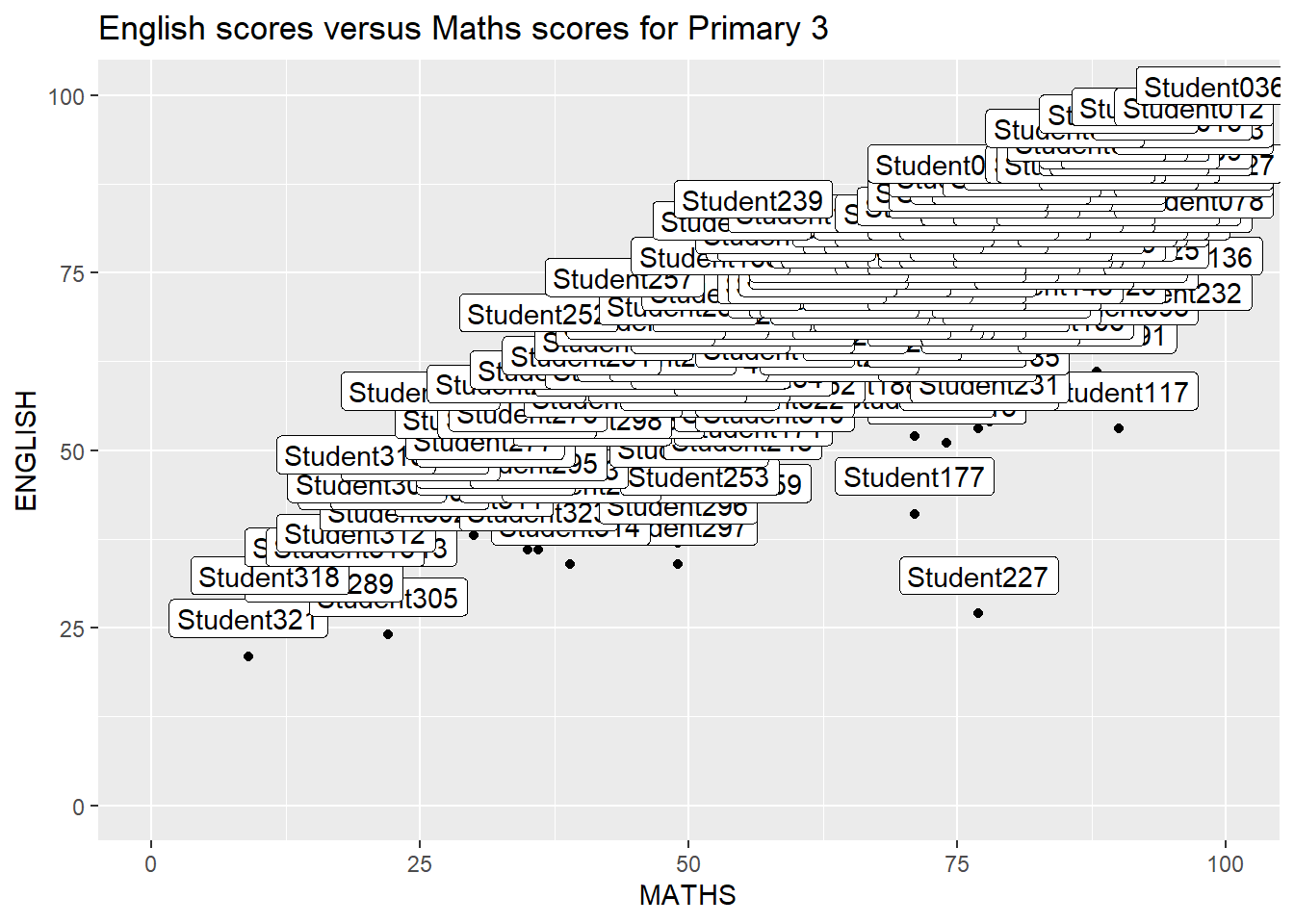
ggplot(data=exam_data,
       aes(x= MATHS,
           y=ENGLISH)) +
  geom_point() +
  geom_smooth(method=lm,
              size=0.5) +
  geom_label(aes(label = ID),
             hjust = .5,
             vjust = -.5) +
  coord_cartesian(xlim=c(0,100),
                  ylim=c(0,100)) +
  ggtitle("English scores versus Maths scores for Primary 3")
2.1 Introduction of ggrepel
ggrepel is an extension of ggplot2 package which provides geoms for ggplot2 to repel overlapping text seen below. Simply replace geom_text() by geom_text_repel() and geom_label() by geom_label_repel.
2.2 Working with ggrepel
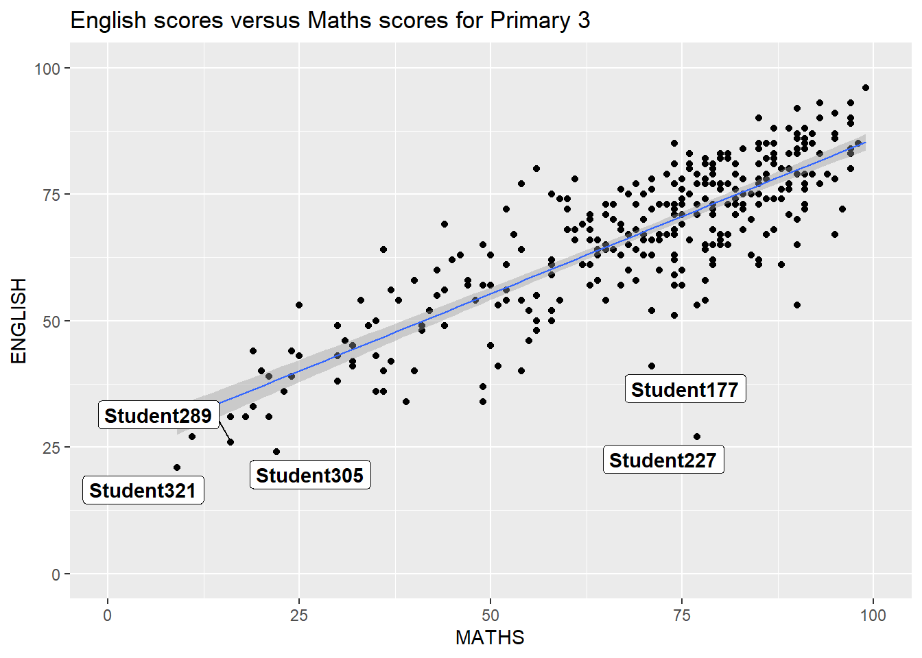
library(ggplot2)
library(ggrepel)

ggplot(data=exam_data,
       aes(x= MATHS,
           y=ENGLISH)) +
  geom_point() +
  geom_smooth(method=lm,
              size=0.5) +
  geom_label_repel(aes(label = ID),
                   fontface = "bold") +
  coord_cartesian(xlim=c(0,100),
                  ylim=c(0,100)) +
  ggtitle("English scores versus Maths scores for Primary 3")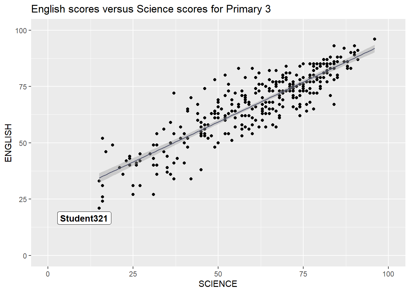
library(ggplot2)
library(ggrepel)

ggplot(data=exam_data,
       aes(x= SCIENCE,
           y=ENGLISH)) +
  geom_point(color = "#8E9AAF") +
  geom_point() +
  geom_smooth(method=lm,
              size=0.5,
              color="#4A4E69") +
  geom_label_repel(aes(label = ID),
                   fontface = "bold") +
  coord_cartesian(xlim=c(0,100),
                  ylim=c(0,100)) +
  ggtitle("English scores versus Science scores for Primary 3")
Note
Benefits of ggrepel
I think its best feature is how it acts like magnets, automatically “pushing” labels apart. No matter how crowded the data points are, the labels will find their own space and never stack on top of each other.
Even if a label gets pushed away to avoid clutter, it automatically draws a thin line back to the original dot. This makes it very easy for the audience to see exactly which data point the label belongs to.
3 Beyond ggplot2 Themes
ggplot2 has eight built-in themes: theme_gray(),theme_bw(),theme_classic(),theme_dark() ,theme_light(),theme_linedraw(),theme_minimal(), theme_void()
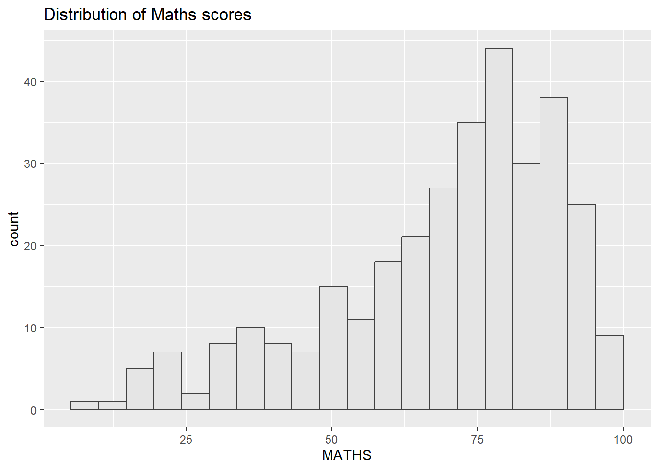
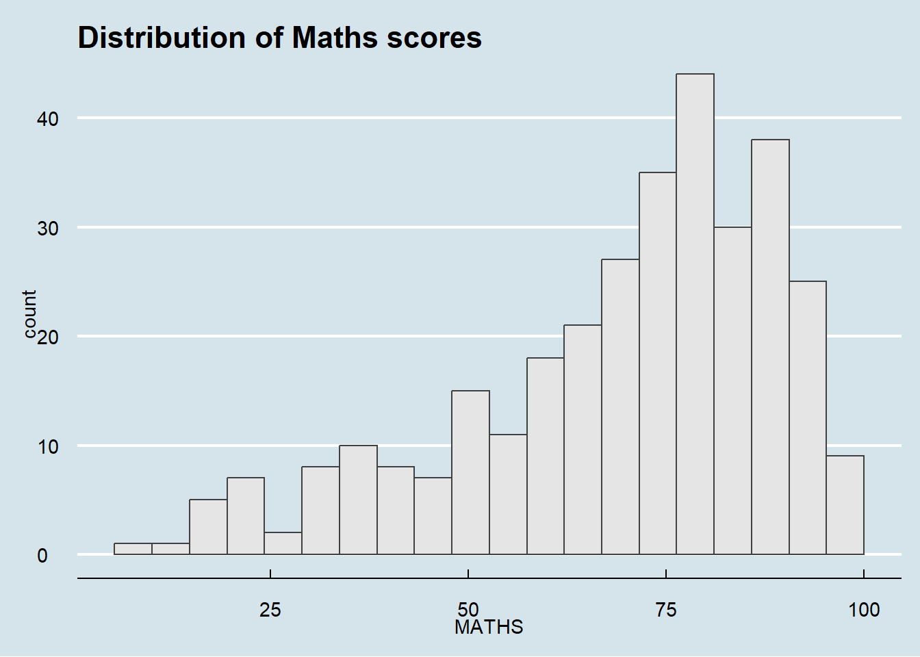
ggplot(data=exam_data,
             aes(x = SCIENCE)) +
  geom_histogram(bins=20,
                 boundary = 100,
                 color="grey25",
                 fill="grey90") +
  theme_classic() +
ggtitle("Distribution of Maths scores") 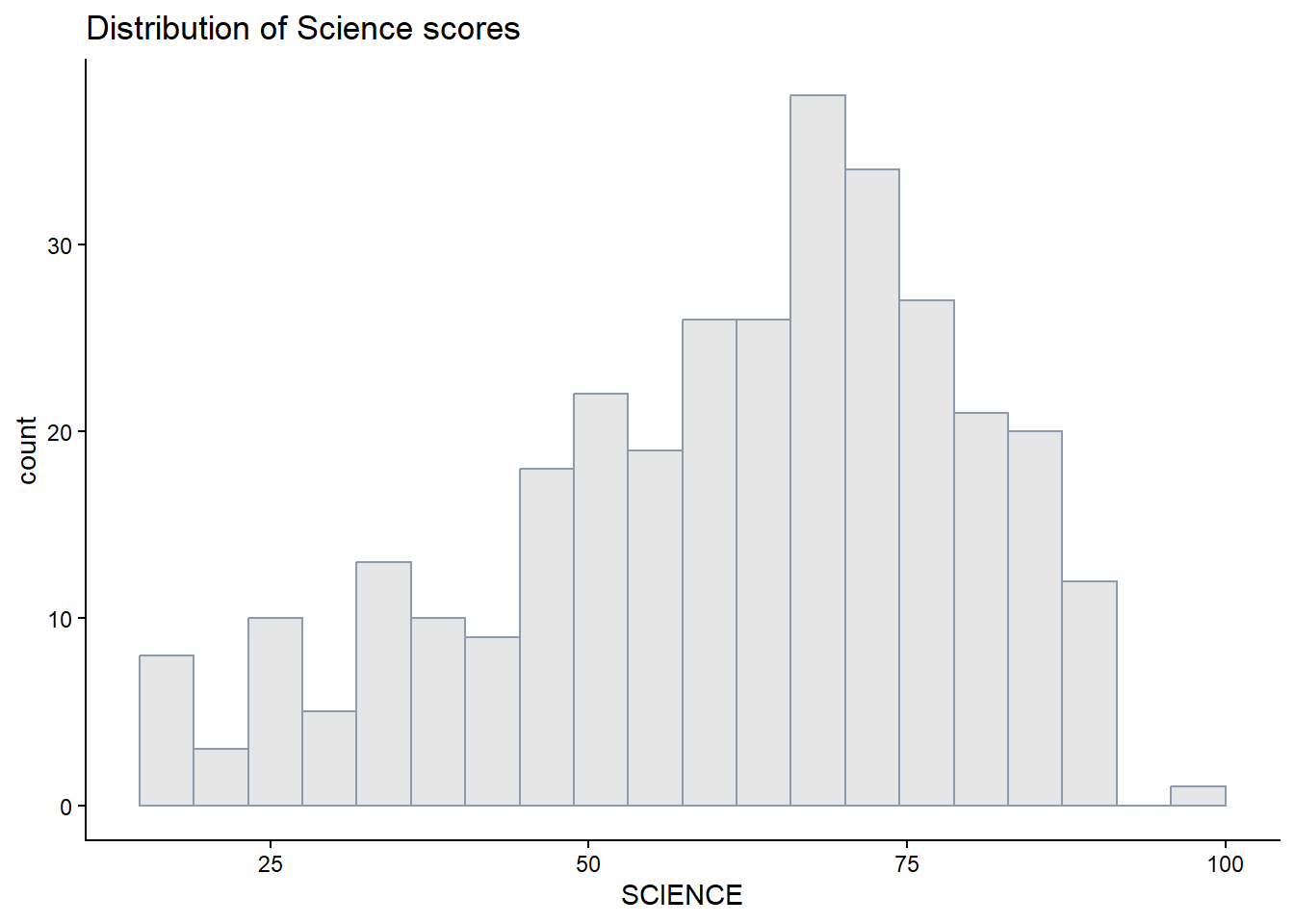
ggplot(data=exam_data,
             aes(x = MATHS)) +
  geom_histogram(bins=20,
                 boundary = 100,
                 color="#8E9AAF",
                 fill="grey90") +
  theme_gray() +
  ggtitle("Distribution of Science scores")
3.1 Working with ggtheme package
ggthemes provides ‘ggplot2’ themes that replicate the look of plots made by:
among others
The Economist theme is used below.
ggplot(data=exam_data,
             aes(x = MATHS)) +
  geom_histogram(bins=20,
                 boundary = 100,
                 color="grey25",
                 fill="grey90") +
  ggtitle("Distribution of Maths scores") +
  theme_economist()
The Wall Street Journal theme is used below.
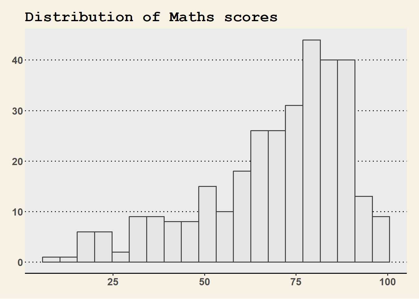
ggplot(data=exam_data,
             aes(x = MATHS)) +
  geom_histogram(bins=20,
                 boundary = 200,
                 color="grey25",
                 fill="grey90") +
  ggtitle("Distribution of Maths scores") +
  theme_wsj() +
  theme(plot.title = element_text(size = 18))
3.2 Working with hrbthems package
hrbrthemes package provides a base theme that focuses on typographic elements, including where various labels are placed as well as the fonts that are used.
library(ggrepel)
library(hrbrthemes)
library(ggplot2)

ggplot(data=exam_data,
             aes(x = MATHS)) +
  geom_histogram(bins=20,
                 boundary = 100,
                 color="grey25",
                 fill="grey90") +
  ggtitle("Distribution of Maths scores") +
  theme_ipsum()
The second goal centers around productivity for a production workflow. In fact, this “production workflow” is the context for where the elements of hrbrthemes should be used.
ggplot(data=exam_data,
             aes(x = MATHS)) +
  geom_histogram(bins=20,
                 boundary = 100,
                 color="grey25",
                 fill="grey90") +
  ggtitle("Distribution of Maths scores") +
  theme_ipsum(axis_title_size = 18,
              base_size = 15,
              grid = "Y")
Note
axis_title_sizeargument is used to increase the font size of the axis title to 18,base_sizeargument is used to increase the default axis label to 15gridargument is used to remove the x-axis grid lines
4 Beyond Single Graph
To build a more compelling narrative, it is often necessary to combine multiple visualizations into a single, cohesive figure. This section focuses on using ggplot2 extensions to facilitate professional plot composition. To begin, we will generate three foundational statistical graphics as the building blocks for our exercise.
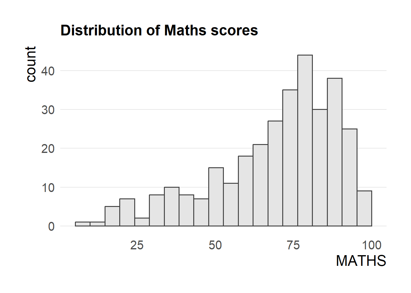
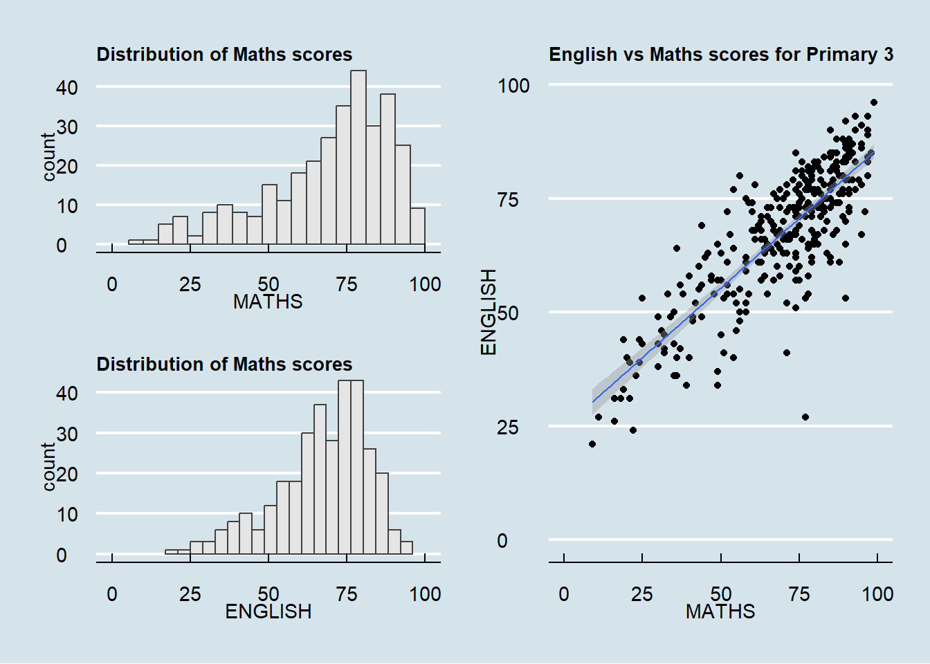
Plot 1: Distribution of Math Scores (Histogram)

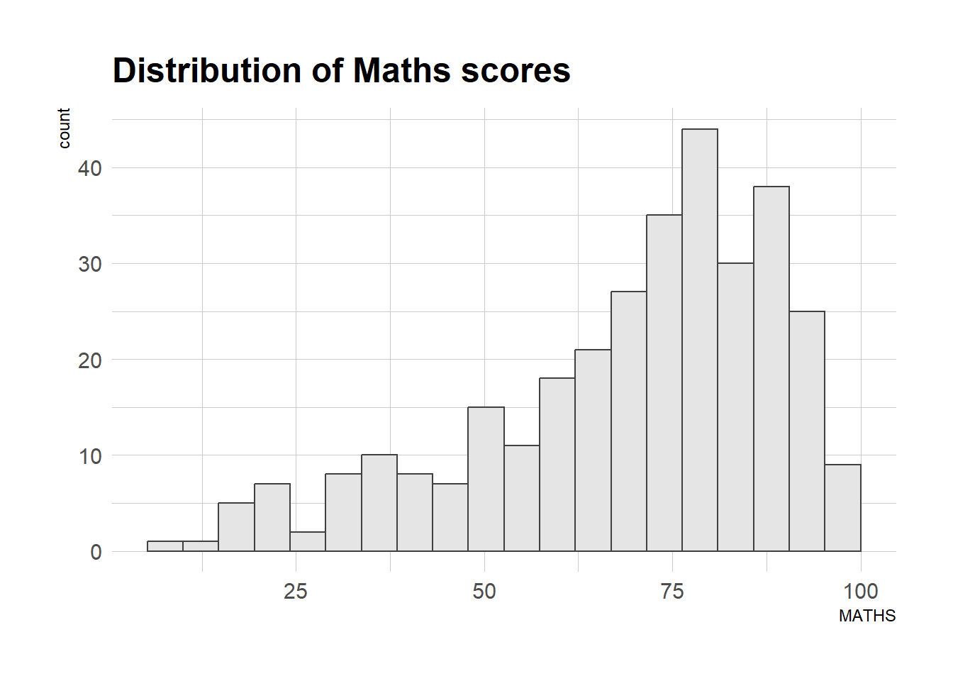
p1 <- ggplot(data=exam_data,
             aes(x = MATHS)) +
  geom_histogram(bins=20,
                 boundary = 100,
                 color="grey25",
                 fill="grey90") +
  coord_cartesian(xlim=c(0,100)) +
  ggtitle("Distribution of Maths scores")

p1
Plot 2: Distribution of English Scores (Histogram)
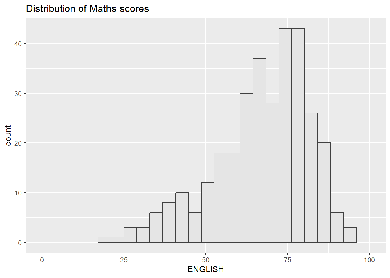
p2 <- ggplot(data=exam_data,
             aes(x = ENGLISH)) +
  geom_histogram(bins=20,
                 boundary = 100,
                 color="grey25",
                 fill="grey90") +
  coord_cartesian(xlim=c(0,100)) +
  ggtitle("Distribution of Maths scores")

p2
Plot 3: English vs Maths score (Scatterplot)
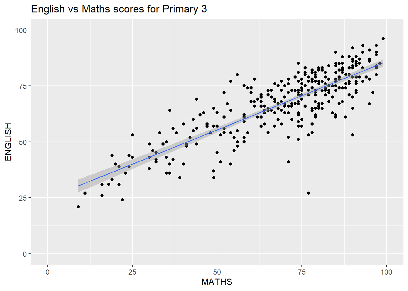
p3 <- ggplot(data=exam_data,
             aes(x= MATHS,
                 y=ENGLISH)) +
  geom_point() +
  geom_smooth(method=lm,
              size=0.5) +
  coord_cartesian(xlim=c(0,100),
                  ylim=c(0,100)) +
  ggtitle("English vs Maths scores for Primary 3")

p3
4.1 Creating Composite Graphics: pathwork methods
There are several ggplot2 extension’s functions support the needs to prepare composite figure by combining several graphs such as grid.arrange() of gridExtra package and plot_grid() of cowplot package.
This section uses a ggplot2 extension called patchwork, specially designed for combining separate ggplot2 graphs into a single figure.
Patchwork package has a very simple syntax to create layouts. General syntax:
Plus Sign “+” - Two-Column Layout
Parenthesis “( )” - Create a subplot group.
Division Sign “/” - Two-Row Layout
4.2 Combining two ggplot2 graphs
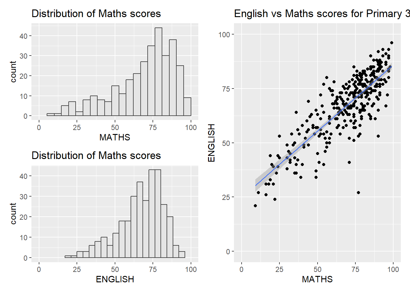
Figure in the tabset below shows a composite of two histograms created using patchwork. Note how simple the syntax used to create the plot!
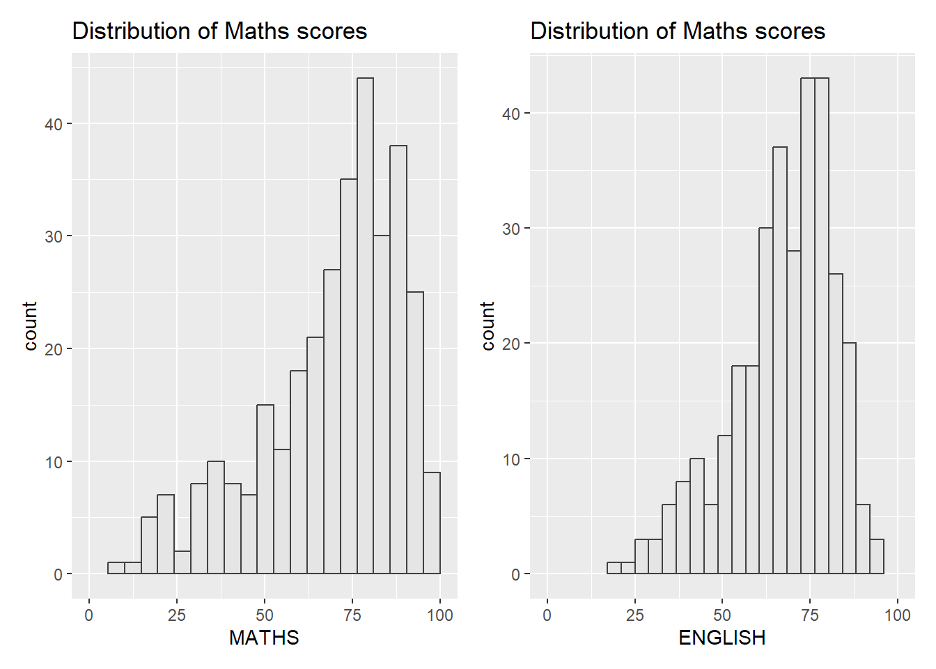
library(patchwork)

p1 + p2
4.3 Combining three ggplot2 graphs
We can plot more complex composite by using appropriate operators. For example, the composite figure below is plotted by using:
More complex composites can be achieved by using appropriate operators. For example, the composite figure below uses:
“/” - stack two ggplot2 graphs on top of another
“|” - place the plots adjacent to each other
“( )” - define plot sequence
(p1 / p2) | p34.4 Creating a composite figure with tag
In order to identify subplots in text, patchwork also provides auto-tagging capabilities as shown in the figure below.
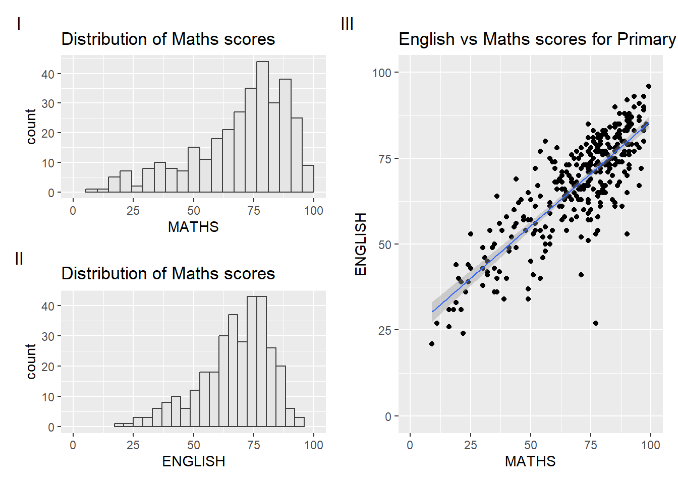
((p1 / p2) | p3) +
  plot_annotation(tag_levels = 'I')
Note
Note the I, II, III labels in the subplots have been automatically labelled.
4.5 Creating figure with insert
Beside providing functions to place plots next to each other based on the provided layout. With inset_element() of patchwork , we can place one or several plots or graphic elements freely on top or below another plot.
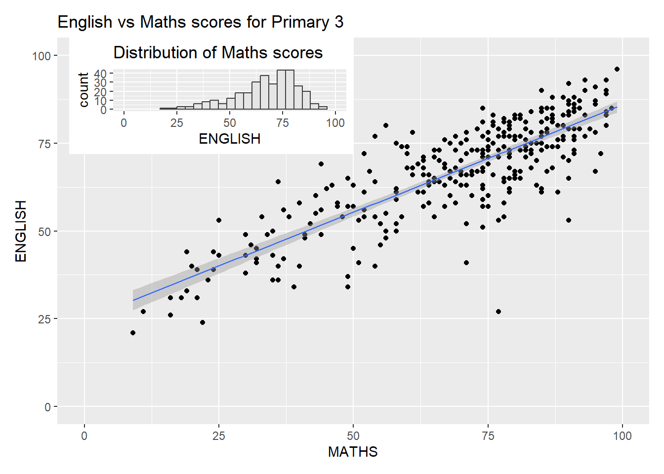
p3 + inset_element(p2,
                   left = 0.02,
                   bottom = 0.7,
                   right = 0.5,
                   top = 1)
4.6 Creating a composite figure by using patchwork and ggtheme
Figure below is created by combining patchwork and theme_economist() of ggthemes package discussed earlier.
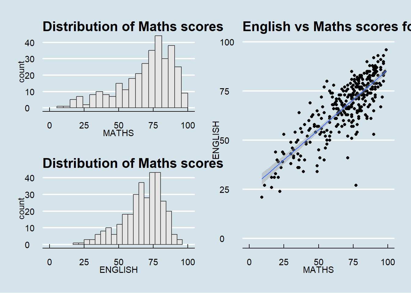
patchwork <- (p1 / p2) | p3
patchwork & theme_economist()
Note
If the text exceeds the plot boundaries, you can add theme(plot.title = element_text(size = 10)) to adjust the font size accordingly
patchwork <- (p1 / p2) | p3
patchwork & theme_economist() &
  theme(plot.title = element_text(size = 10))