pacman::p_load(scales, viridis, lubridate, ggthemes, gridExtra, readxl, knitr, data.table, CGPfunctions, ggHoriPlot, tidyverse)Hands-On Exercise 07
Overview
1 Getting Started
1.1 Installing and loading the packages
Write a code chunk to check, install and launch the following R packages: scales, viridis, lubridate, ggthemes, gridExtra, readxl, knitr, data.table and tidyverse.
1.2 Introduction : Plotting Calendar Heatmap
In this section, you will learn how to plot a calender heatmap programmatically by using ggplot2 package.
By the end of this section, you will be able to:
plot a calender heatmap by using ggplot2 functions and extension,
to write function using R programming,
to derive specific date and time related field by using base R and lubridate packages
to perform data preparation task by using tidyr and dplyr packages.
1.3 The Data
For the purpose of this hands-on exercise, eventlog.csv file will be used. This data file consists of 199,999 rows of time-series cyber attack records by country.
1.4 Importing the data
We will use the code chunk below to import eventlog.csv file into R environment and called the data frame as attacks.
attacks <- read_csv("data/eventlog.csv")1.5 Examining the data structure
kable() can be used to review the structure of the imported data frame
kable(head(attacks))| timestamp | source_country | tz |
|---|---|---|
| 2015-03-12 15:59:16 | CN | Asia/Shanghai |
| 2015-03-12 16:00:48 | FR | Europe/Paris |
| 2015-03-12 16:02:26 | CN | Asia/Shanghai |
| 2015-03-12 16:02:38 | US | America/Chicago |
| 2015-03-12 16:03:22 | CN | Asia/Shanghai |
| 2015-03-12 16:03:45 | CN | Asia/Shanghai |
There are three columns, namely timestamp, source_country and tz.
timestamp field stores date-time values in POSIXct format.
source_country field stores the source of the attack. It is in ISO 3166-1 alpha-2 country code.
tz field stores time zone of the source IP address.
1.6 Data Preparation
Step 1: Deriving weekday and hour of day fields
Before we can plot the calender heatmap, two new fields namely wkday and hour need to be derived. In this step, we will write a function to perform the task.
make_hr_wkday <- function(ts, sc, tz) {
  real_times <- ymd_hms(ts,
                        tz = tz[1],
                        quiet = TRUE)
  dt <- data.table(source_country = sc,
                   wkday = weekdays(real_times),
                   hour = hour(real_times))
  return(dt)
}
Step 2: Deriving the attacks tibble data frame
wkday_levels <- c('Saturday', 'Friday',
                  'Thursday', 'Wednesday',
                  'Tuesday', 'Monday',
                  'Sunday')

attacks <- attacks %>%
  group_by(tz) %>%
  do(make_hr_wkday(.$timestamp,
                   .$source_country,
                   .$tz)) %>%
  ungroup() %>%
  mutate(wkday = factor(
    wkday, levels = wkday_levels),
    hour  = factor(
      hour, levels = 0:23))
Step 3: Check the final table
kable(head(attacks))| tz | source_country | wkday | hour |
|---|---|---|---|
| Africa/Cairo | BG | Saturday | 20 |
| Africa/Cairo | TW | Sunday | 6 |
| Africa/Cairo | TW | Sunday | 8 |
| Africa/Cairo | CN | Sunday | 11 |
| Africa/Cairo | US | Sunday | 15 |
| Africa/Cairo | CA | Monday | 11 |
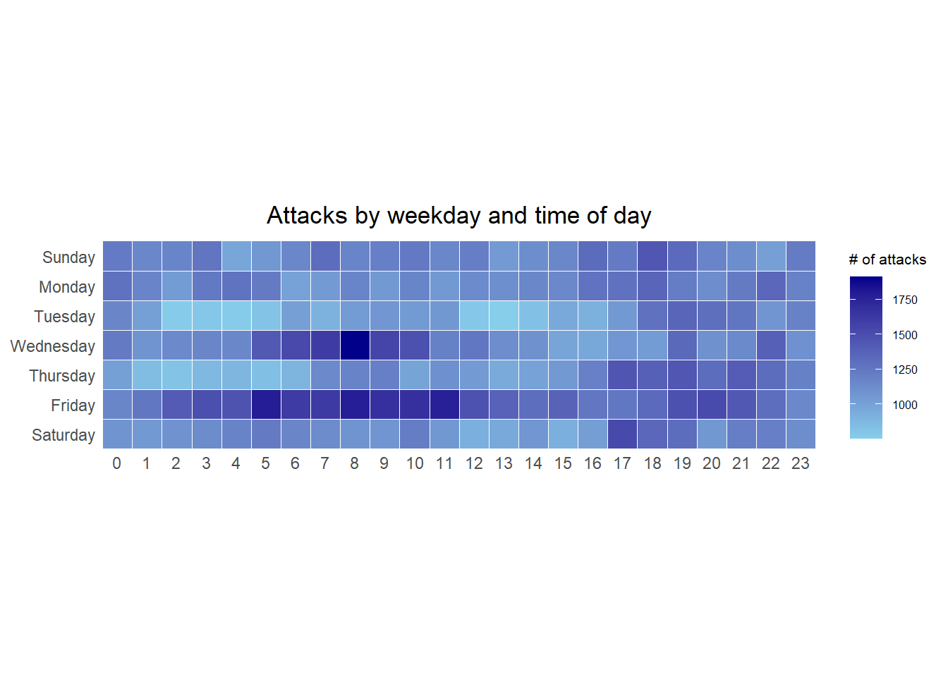
2 Visualization : Heatmaps
2.1 Building the Calendar Heatmaps
grouped <- attacks %>%
  count(wkday, hour) %>%
  ungroup() %>%
  na.omit()

ggplot(grouped,
       aes(hour,
           wkday,
           fill = n)) +
geom_tile(color = "white",
          size = 0.1) +
theme_tufte(base_family = "Helvetica") +
coord_equal() +
scale_fill_gradient(name = "# of attacks",
                    low = "sky blue",
                    high = "dark blue") +
labs(x = NULL,
     y = NULL,
     title = "Attacks by weekday and time of day") +
theme(axis.ticks = element_blank(),
      plot.title = element_text(hjust = 0.5),
      legend.title = element_text(size = 8),
      legend.text = element_text(size = 6) )
Note
A tibble data table called grouped is derived by aggregating the attack by wkday and hour fields.
A new field called n is derived by using
group_by()andcount()functions. na.omit() is used to exclude missing value.geom_tile()is used to plot tiles (grids) at each x and y position.colorandsizearguments are used to specify the border color and line size of the tiles.theme_tufte()of ggthemes package is used to remove unnecessary chart junk. To learn which visual components of default ggplot2 have been excluded, you are encouraged to comment out this line to examine the default plot.coord_equal()is used to ensure the plot will have an aspect ratio of 1:1.scale_fill_gradient()function is used to creates a two colour gradient (low-high).
2.2 Building Multiple Calendar Heatmaps
Step 1: Deriving attack by country object
In order to identify the top 4 countries with the highest number of attacks, you are required to do the followings:
count the number of attacks by country,
calculate the percent of attackes by country, and
save the results in a tibble data frame.
attacks_by_country <- count(
  attacks, source_country) %>%
  mutate(percent = percent(n/sum(n))) %>%
  arrange(desc(n))
Step 2: Preparing the tidy data frame
In this step, you are required to extract the attack records of the top 4 countries from attacks data frame and save the data in a new tibble data frame (i.e. top4_attacks).
top4 <- attacks_by_country$source_country[1:4]
top4_attacks <- attacks %>%
  filter(source_country %in% top4) %>%
  count(source_country, wkday, hour) %>%
  ungroup() %>%
  mutate(source_country = factor(
    source_country, levels = top4)) %>%
  na.omit()
Step 3: Plotting the Multiple Calender Heatmap by using ggplot2 package.
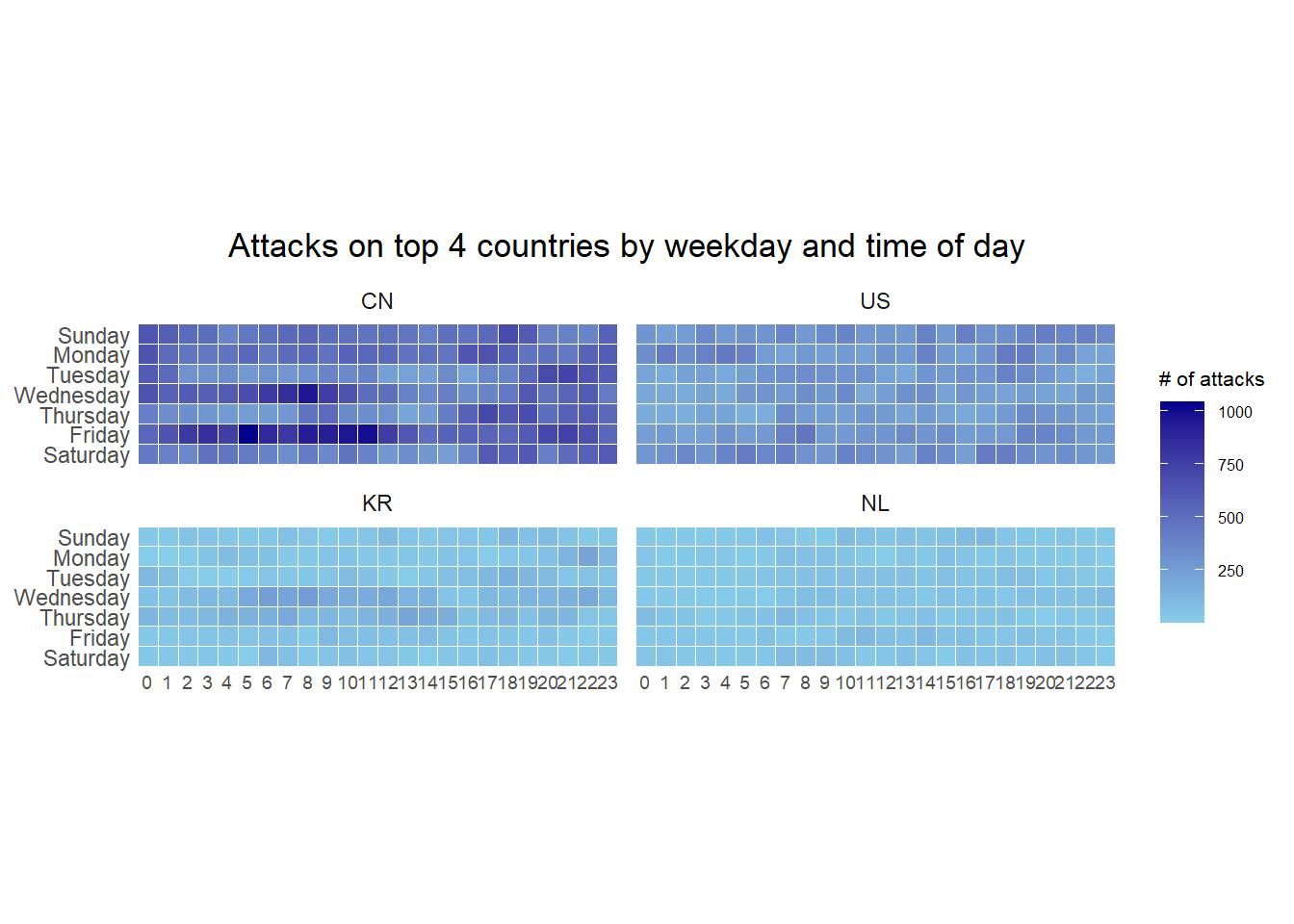
ggplot(top4_attacks,
       aes(hour,
           wkday,
           fill = n)) +
  geom_tile(color = "white",
          size = 0.1) +
  theme_tufte(base_family = "Helvetica") +
  coord_equal() +
  scale_fill_gradient(name = "# of attacks",
                    low = "sky blue",
                    high = "dark blue") +
  facet_wrap(~source_country, ncol = 2) +
  labs(x = NULL, y = NULL,
     title = "Attacks on top 4 countries by weekday and time of day") +
  theme(axis.ticks = element_blank(),
        axis.text.x = element_text(size = 7),
        plot.title = element_text(hjust = 0.5),
        legend.title = element_text(size = 8),
        legend.text = element_text(size = 6) )
2.3 Building the Country and Weekday Heatmap
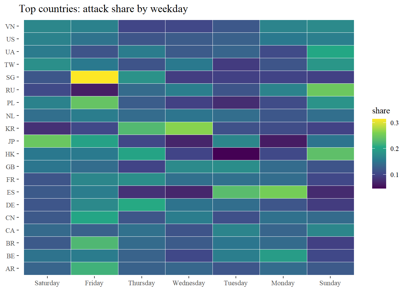
This heatmap visualizes the distribution of cyber attacks across weekdays for each country, helping identify whether certain countries exhibit recurring weekly attack patterns.
wkday_levels <- c('Saturday', 'Friday',
                  'Thursday', 'Wednesday',
                  'Tuesday', 'Monday',
                  'Sunday')

attacks <- read_csv("data/eventlog.csv") %>%
  group_by(tz) %>%
  do(make_hr_wkday(.$timestamp,
                   .$source_country,
                   .$tz)) %>%
  ungroup() %>%
  mutate(wkday = factor(wkday, levels = wkday_levels),
         hour  = factor(hour, levels = 0:23)) %>%
  drop_na(wkday, hour, source_country)

country_wkday <- attacks %>%
  count(source_country, wkday) %>%
  group_by(source_country) %>%
  mutate(p = n / sum(n)) %>%
  ungroup()

topN <- attacks %>% count(source_country) %>% slice_max(n, n = 20) %>% pull(source_country)

ggplot(filter(country_wkday, source_country %in% topN),
       aes(wkday, fct_reorder(source_country, p, .fun = sum), fill = p)) +
  geom_tile(color="white", size=0.1) +
  scale_fill_viridis_c(name="share") +
  labs(x=NULL, y=NULL, title="Top countries: attack share by weekday") +
  theme_tufte()
2.4 Building the Date and Hour Heatmap
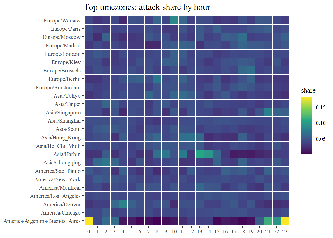
This heatmap shows daily and hourly attack intensity, helping detect spike days and intra-day bursts.
wkday_levels <- c('Saturday', 'Friday',
                  'Thursday', 'Wednesday',
                  'Tuesday', 'Monday',
                  'Sunday')

attacks <- read_csv("data/eventlog.csv") %>%
  group_by(tz) %>%
  mutate(real_time = ymd_hms(timestamp, tz = first(tz), quiet = TRUE),
         wkday = factor(weekdays(real_time), levels = wkday_levels),
         hour  = factor(hour(real_time), levels = 0:23)) %>%
  ungroup() %>%
  drop_na(wkday, hour, source_country)

tz_hour <- attacks %>%
  count(tz, hour) %>%
  group_by(tz) %>%
  mutate(p = n / sum(n)) %>%
  ungroup()

topTZ <- attacks %>% count(tz) %>% slice_max(n, n = 25) %>% pull(tz)

ggplot(filter(tz_hour, tz %in% topTZ),
       aes(hour, fct_reorder(tz, p, .fun=sum), fill = p)) +
  geom_tile(color="white", size=0.1) +
  scale_fill_viridis_c(name="share") +
  labs(x=NULL, y=NULL, title="Top timezones: attack share by hour") +
  theme_tufte()
3 Visualization : Cycle Plot
In this section, we will learn how to plot a cycle plot showing the time-series patterns and trend of visitor arrivals from Vietnam programmatically by using ggplot2 functions.
Step 1: Data Import
For the purpose of this hands-on exercise, arrivals_by_air.xlsx will be used.
The code chunk below imports arrivals_by_air.xlsx by using read_excel() of readxl package and save it as a tibble data frame called air.
air <- read_excel("data/arrivals_by_air.xlsx")Step 2: Deriving month and year fields
Next, two new fields called month and year are derived from Month-Year field.
air$month <- factor(month(air$`Month-Year`),
                    levels=1:12,
                    labels=month.abb,
                    ordered=TRUE)
air$year <- year(ymd(air$`Month-Year`))
Step 3: Extracting the target country
Next, the code chunk below is use to extract data for the target country (i.e. Vietnam)
Vietnam <- air %>%
  select(`Vietnam`,
         month,
         year) %>%
  filter(year >= 2010)
Step 4: Computing year average arrivals by month
The code chunk below uses group_by() and summarise() of dplyr to compute year average arrivals by month.
hline.data <- Vietnam %>%
  group_by(month) %>%
  summarise(avgvalue = mean(`Vietnam`))
Step 5: Check the final table
kable(head(hline.data))| month | avgvalue |
|---|---|
| Jan | 24113.4 |
| Feb | 26693.4 |
| Mar | 27200.1 |
| Apr | 30390.8 |
| May | 31452.9 |
| Jun | 41325.3 |
Step 6: Plotting the cycle plot
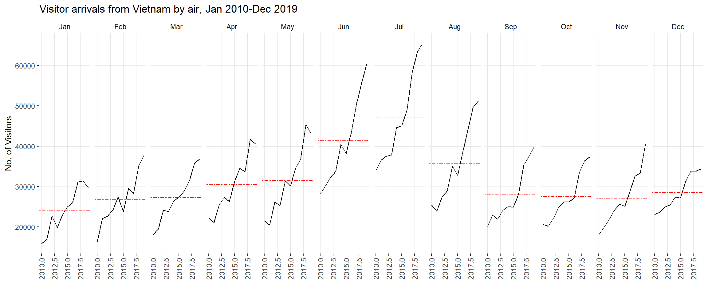
ggplot() +
  geom_line(data=Vietnam,
            aes(x=year,
                y=`Vietnam`,
                group=month),
            colour="black") +
  geom_hline(aes(yintercept=avgvalue),
             data=hline.data,
             linetype=6,
             colour="red",
             size=0.5) +
  facet_grid(~month) +
  labs(axis.text.x = element_blank(),
       title = "Visitor arrivals from Vietnam by air, Jan 2010-Dec 2019") +
  xlab("") +
  ylab("No. of Visitors") +
  theme_tufte(base_family = "Helvetica")+
  theme(  axis.text.x = element_text(angle = 90, vjust = 0.5, hjust = 1),
  panel.grid.major = element_line(colour = "gray90", size = 0.2))
This version removes the monthly average (de-meaning) so the y-axis represents deviation from the typical level of that month. It highlights unusually high/low years within each month and improves comparability across months by focusing on relative departures instead of absolute volume.
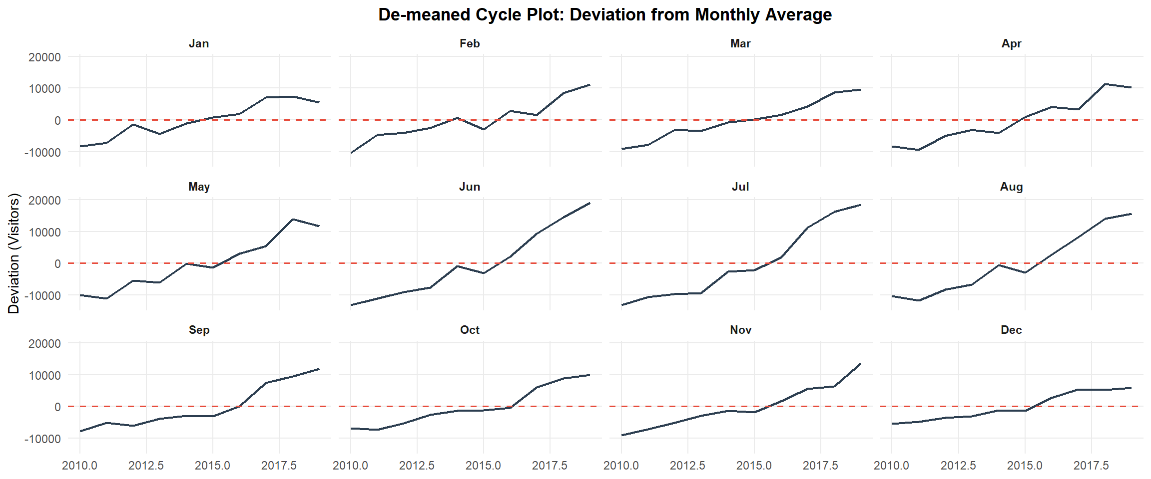
Vietnam_dev <- Vietnam %>%
  group_by(month) %>%
  mutate(avg = mean(Vietnam, na.rm = TRUE),
         deviation = Vietnam - avg) %>%
  ungroup()

ggplot(Vietnam_dev, aes(year, deviation)) +
  geom_line(color = "#2c3e50", linewidth = 0.8) +
  geom_hline(yintercept = 0, linetype = "dashed", color = "#e74c3c", linewidth = 0.6) +
  facet_wrap(~month, nrow = 3) +
  labs(title = "De-meaned Cycle Plot: Deviation from Monthly Average",
       x = NULL, y = "Deviation (Visitors)") +
  theme_minimal(base_size = 11) +
  theme(
    panel.grid.minor = element_blank(),
    plot.title = element_text(hjust = 0.5, face = "bold"),
    strip.text = element_text(face = "bold")
  )
This plot expresses deviations as percentages: (value − average) / average. Compared with absolute deviation, percentage deviation avoids scale effects (peak months naturally have larger absolute swings), making volatility more comparable across low- and high-volume months.
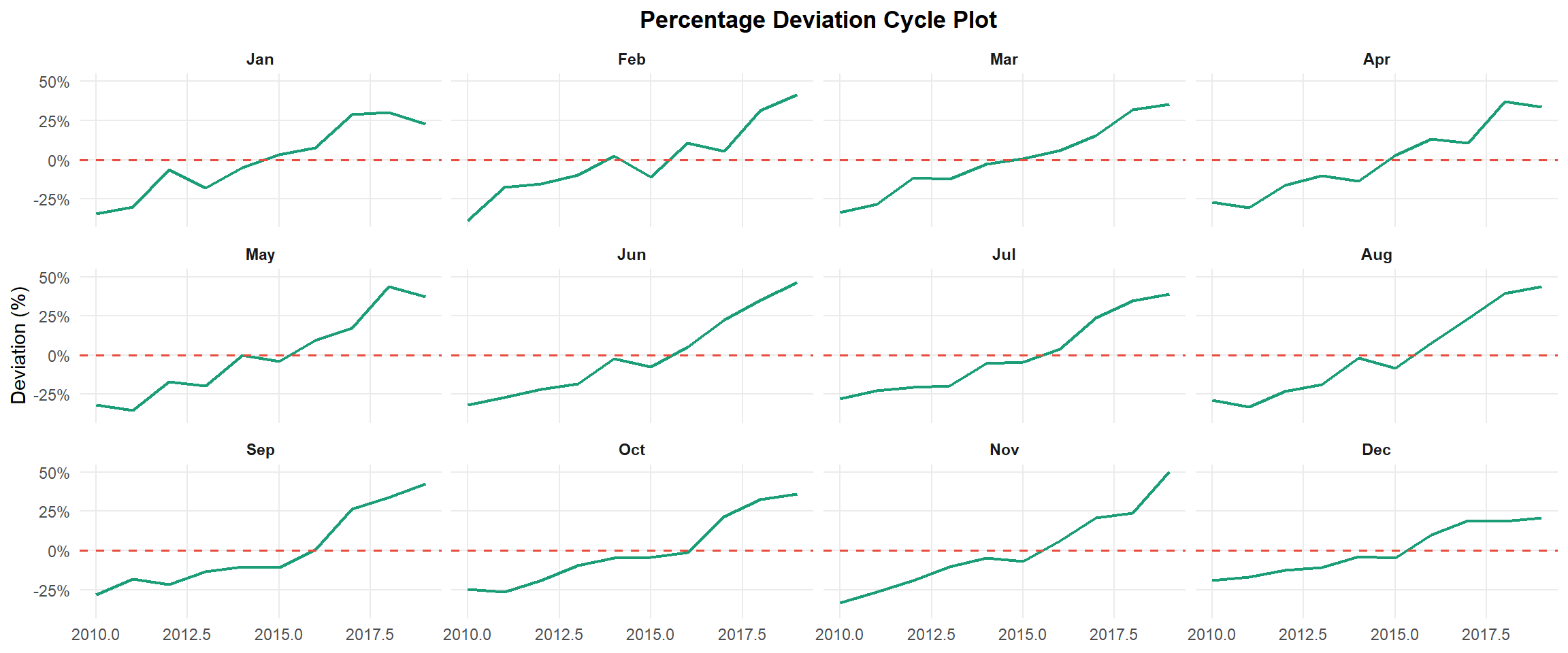
Vietnam_pct <- Vietnam %>%
  group_by(month) %>%
  mutate(avg = mean(Vietnam, na.rm = TRUE),
         pct_dev = (Vietnam - avg) / avg) %>%
  ungroup()

ggplot(Vietnam_pct, aes(year, pct_dev)) +
  geom_line(color = "#1b9e77", linewidth = 0.8) +
  geom_hline(yintercept = 0, linetype = "dashed", color = "#e74c3c", linewidth = 0.6) +
  facet_wrap(~month, nrow = 3) +
  scale_y_continuous(labels = scales::percent) +
  labs(title = "Percentage Deviation Cycle Plot",
       x = NULL, y = "Deviation (%)") +
  theme_minimal(base_size = 11) +
  theme(
    panel.grid.minor = element_blank(),
    plot.title = element_text(hjust = 0.5, face = "bold"),
    strip.text = element_text(face = "bold")
  )
This plot computes year-over-year (YoY) growth by comparing each month to the same month in the previous year. YoY is often more business-relevant than raw counts because it measures expansion pace and highlights volatility patterns across months.
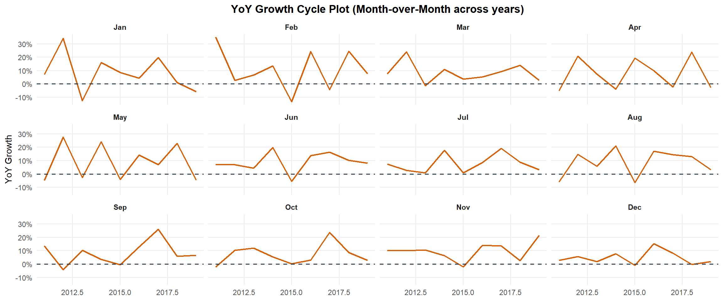
Vietnam_yoy <- Vietnam %>%
  arrange(year, month) %>%
  mutate(yoy = (Vietnam - lag(Vietnam, 12)) / lag(Vietnam, 12)) %>%
  drop_na(yoy)

ggplot(Vietnam_yoy, aes(year, yoy)) +
  geom_line(color = "#d95f02", linewidth = 0.8) +
  geom_hline(yintercept = 0, linetype = "dashed", color = "#2c3e50", linewidth = 0.6) +
  facet_wrap(~month, nrow = 3) +
  scale_y_continuous(labels = scales::percent) +
  labs(title = "YoY Growth Cycle Plot (Month-over-Month across years)",
       x = NULL, y = "YoY Growth") +
  theme_minimal(base_size = 11) +
  theme(
    panel.grid.minor = element_blank(),
    plot.title = element_text(hjust = 0.5, face = "bold"),
    strip.text = element_text(face = "bold")
  )
4 Visualization : Plotting Slopegraph
In this section you will learn how to plot a slopegraph by using R.
Before getting start, make sure that CGPfunctions has been installed and loaded onto R environment. Then, refer to Using newggslopegraph to learn more about the function. Lastly, read more about newggslopegraph() and its arguments by referring to this link.
Step 1: Data Import
rice <- read_csv("data/rice.csv")Step 2: Plotting the slopegraph
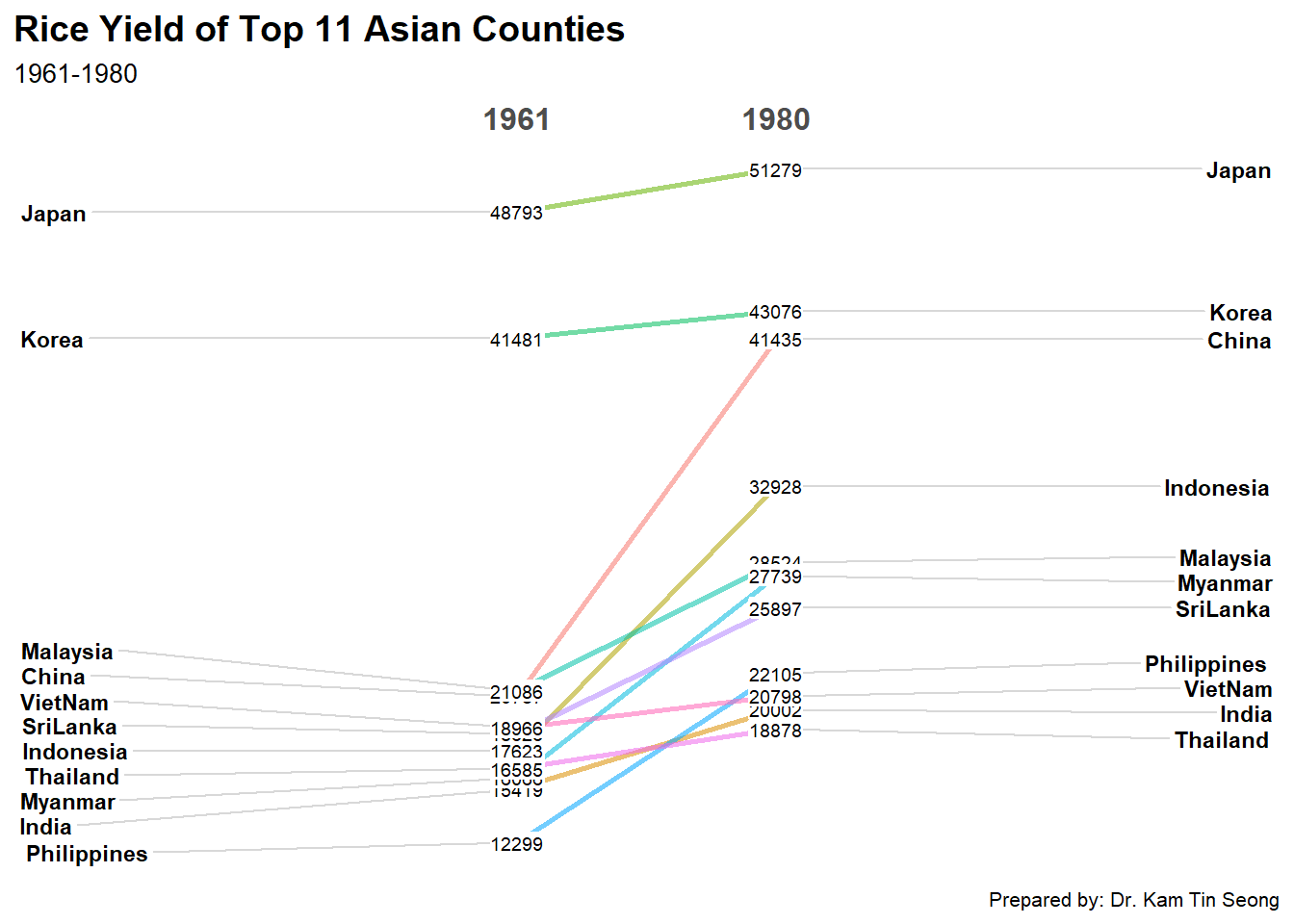
rice %>%
  mutate(Year = factor(Year)) %>%
  filter(Year %in% c(1961, 1980)) %>%
  newggslopegraph(Year, Yield, Country,
                Title = "Rice Yield of Top 11 Asian Counties",
                SubTitle = "1961-1980",
                Caption = "Prepared by: Dr. Kam Tin Seong")