pacman::p_load(tmap, tidyverse, sf)Hands-On Exercise 08-3
Overview
In this in-class exercise, you will gain hands-on experience on using appropriate R methods to plot analytical maps.
Learning outcome:
- Importing geospatial data in rds format into R environment.
- Creating cartographic quality choropleth maps by using appropriate tmap functions.
- Creating rate map
- Creating percentile map
- Creating boxmap
1 Getting Started
1.1 Installing and loading the packages
The code chunk below will be used to install and load these packages in RStudio.
1.2 Importing data
For the purpose of this hands-on exercise, a prepared data set called NGA_wp.rds will be used. The data set is a polygon feature data.frame providing information on water point of Nigeria at the LGA level.
NGA_wp <- read_rds("data/NGA_wp.rds")glimpse(NGA_wp)Rows: 774
Columns: 9
$ ADM2_EN <chr> "Aba North", "Aba South", "Abadam", "Abaji", "Abak", …
$ ADM2_PCODE <chr> "NG001001", "NG001002", "NG008001", "NG015001", "NG00…
$ ADM1_EN <chr> "Abia", "Abia", "Borno", "Federal Capital Territory",…
$ ADM1_PCODE <chr> "NG001", "NG001", "NG008", "NG015", "NG003", "NG011",…
$ geometry <MULTIPOLYGON [m]> MULTIPOLYGON (((548795.5 11..., MULTIPOL…
$ total_wp <int> 17, 71, 0, 57, 48, 233, 34, 119, 152, 66, 39, 135, 63…
$ wp_functional <int> 7, 29, 0, 23, 23, 82, 16, 72, 79, 18, 25, 54, 28, 55,…
$ wp_nonfunctional <int> 9, 35, 0, 34, 25, 42, 15, 33, 62, 26, 13, 73, 35, 36,…
$ wp_unknown <int> 1, 7, 0, 0, 0, 109, 3, 14, 11, 22, 1, 8, 0, 37, 88, 1…2 Basic Choropleth Mapping
2.1 Visualising distribution of non-functional water point
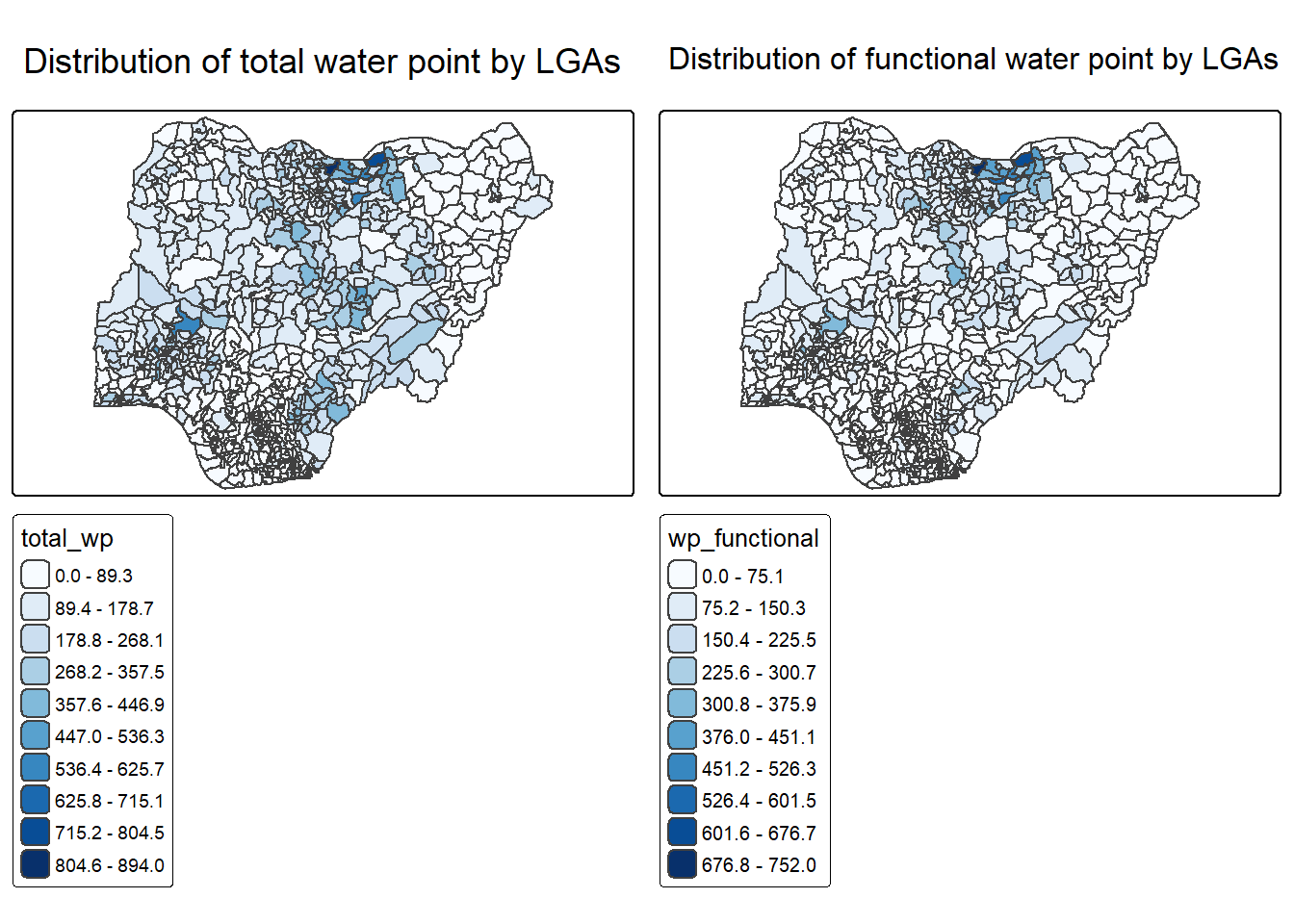
p1 <- tm_shape(NGA_wp) +
  tm_polygons(
    fill = "wp_functional",
    fill.scale = tm_scale_intervals(
      style = "equal",
      n = 10,
      values = "brewer.blues"
    )
  ) +
  tm_borders(lwd = 0.1) +
  tm_title("Distribution of functional water point by LGAs") +
  tm_layout(
    legend.outside = TRUE,
    legend.outside.position = "right"
  )

p2 <- tm_shape(NGA_wp) +
  tm_polygons(
    fill = "total_wp",
    fill.scale = tm_scale_intervals(
      style = "equal",
      n = 10,
      values = "brewer.blues"
    )
  ) +
  tm_borders(lwd = 0.1) +
  tm_title("Distribution of total water point by LGAs") +
  tm_layout(
    legend.outside = TRUE,
    legend.outside.position = "right"
  )

tmap_arrange(p2, p1, nrow = 1)
2.2 Choropleth Map for Rates
In much of our readings we have now seen the importance to map rates rather than counts of things, and that is for the simple reason that water points are not equally distributed in space. That means that if we do not account for how many water points are somewhere, we end up mapping total water point size rather than our topic of interest.
2.2.1 Deriving Proportion of Functional Water Points and Non-Functional Water Points
We will tabulate the proportion of functional water points and the proportion of non-functional water points in each LGA. In the following code chunk, mutate() from dplyr package is used to derive two fields, namely pct_functional and pct_nonfunctional.
NGA_wp <- NGA_wp %>%
  mutate(pct_functional = wp_functional/total_wp) %>%
  mutate(pct_nonfunctional = wp_nonfunctional/total_wp)
2.2.2 Plotting map of rate
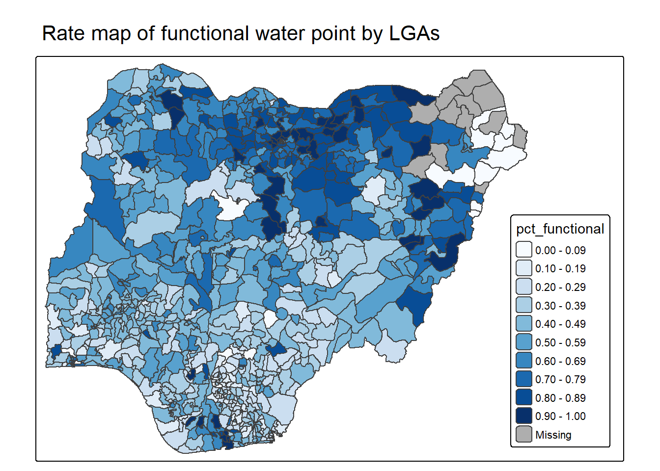
tm_shape(NGA_wp) +
  tm_polygons(
    "pct_functional",
    fill.scale = tm_scale_intervals(
      style = "equal",
      n = 10,
      values = "brewer.blues"
    ),
    fill.legend = tm_legend(position = c("right", "bottom"))
  ) +
  tm_borders(lwd = 0.1) +
  tm_title("Rate map of functional water point by LGAs") +
  tm_layout(
    inner.margins = c(0.02, 0.02, 0.02, 0.20),
    legend.frame = TRUE
  )
2.3 Extreme Value Maps
Extreme value maps are variations of common choropleth maps where the classification is designed to highlight extreme values at the lower and upper end of the scale, with the goal of identifying outliers. These maps were developed in the spirit of spatializing EDA, i.e., adding spatial features to commonly used approaches in non-spatial EDA (Anselin 1994).
2.3.1 Percentile Map
The percentile map is a special type of quantile map with six specific categories: 0-1%,1-10%, 10-50%,50-90%,90-99%, and 99-100%. The corresponding breakpoints can be derived by means of the base R quantile command, passing an explicit vector of cumulative probabilities as c(0,.01,.1,.5,.9,.99,1). Note that the begin and endpoint need to be included.
2.3.1.1 Data Preparation
Step 1: Exclude records with NA by using the code chunk below.
NGA_wp <- NGA_wp %>%
  drop_na()
Step 2: Creating customised classification and extracting values
percent <- c(0,.01,.1,.5,.9,.99,1)
var <- NGA_wp["pct_functional"] %>%
  st_set_geometry(NULL)
quantile(var[,1], percent)
0% 1% 10% 50% 90% 99% 100%
0.0000000 0.0000000 0.2169811 0.4791667 0.8611111 1.0000000 1.0000000 2.3.1.2 Creating the get.var function
Firstly, we will write an R function as shown below to extract a variable (i.e. wp_nonfunctional) as a vector out of an sf data.frame.
- arguments:
- vname: variable name (as character, in quotes)
- df: name of sf data frame
- returns:
- v: vector with values (without a column name)
get.var <- function(vname,df) {
  v <- df[vname] %>%
    st_set_geometry(NULL)
  v <- unname(v[,1])
  return(v)
}
2.3.1.3 A percentile mapping function
percentmap <- function(vnam, df, legtitle=NA, mtitle="Percentile Map"){
  percent <- c(0,.01,.1,.5,.9,.99,1)
  var <- get.var(vnam, df)
  bperc <- quantile(var, percent)
  tm_shape(df) +
  tm_polygons() +
  tm_shape(df) +
     tm_polygons(vnam,
             title=legtitle,
             breaks=bperc,
             palette="Blues",
          labels=c("< 1%", "1% - 10%", "10% - 50%", "50% - 90%", "90% - 99%", "> 99%"))  +
  tm_borders() +
  tm_layout(main.title = mtitle,
            title.position = c("right","bottom"))
}
2.3.1.4 Test drive the percentile mapping function
percentmap("total_wp", NGA_wp)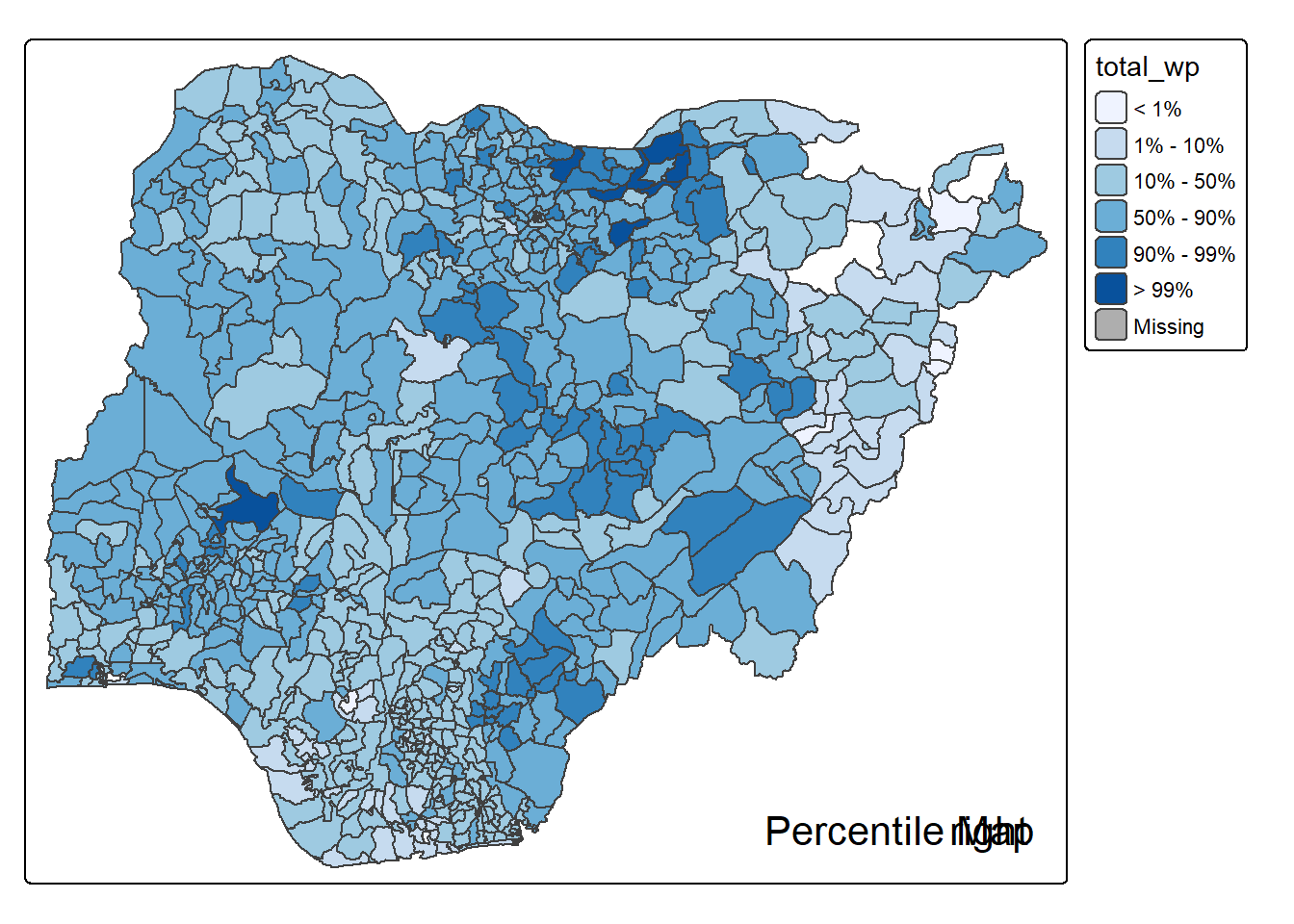
2.3.1.5 Percentile Map with Top 10% Highlighted
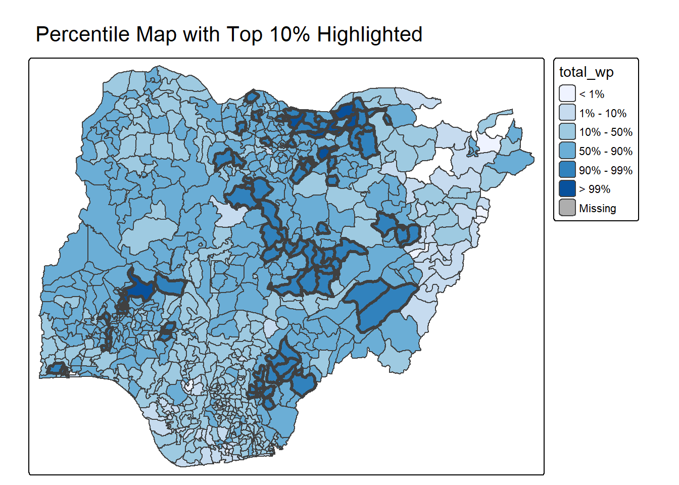
percentmap_highlight_top10 <- function(vnam, df) {

  percent <- c(0,.01,.1,.5,.9,.99,1)
  var <- get.var(vnam, df)
  bperc <- quantile(var, percent)

  q90 <- quantile(var, 0.9)

  df$top10_flag <- df[[vnam]] >= q90

  tm_shape(df) +
    tm_polygons(vnam,
      breaks=bperc,
      palette="Blues",
      labels=c("< 1%", "1% - 10%", "10% - 50%", "50% - 90%", "90% - 99%", "> 99%")
    ) +
    tm_shape(df[df$top10_flag, ]) +
      tm_borders(lwd=3) +
    tm_layout(main.title="Percentile Map with Top 10% Highlighted")
}

percentmap_highlight_top10("total_wp", NGA_wp)
2.3.1.6 Top 10% Cluster Detection
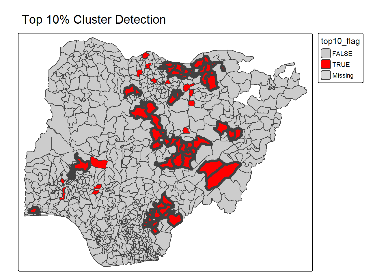
percentmap_cluster_check <- function(vnam, df){

  var <- get.var(vnam, df)
  q90 <- quantile(var, 0.9)

  df$top10_flag <- df[[vnam]] >= q90

  top_area <- df[df$top10_flag, ]

  neighbors <- st_touches(top_area)
  cluster_flag <- lengths(neighbors) > 0

  top_area$clustered <- cluster_flag

  tm_shape(df) +
    tm_polygons("top10_flag",
                palette=c("TRUE"="red","FALSE"="grey80")) +
    tm_shape(top_area[top_area$clustered,]) +
      tm_borders(lwd=4) +
    tm_layout(main.title="Top 10% Cluster Detection")
}

percentmap_cluster_check("total_wp", NGA_wp)
2.3.1.7 Hotspot vs Others
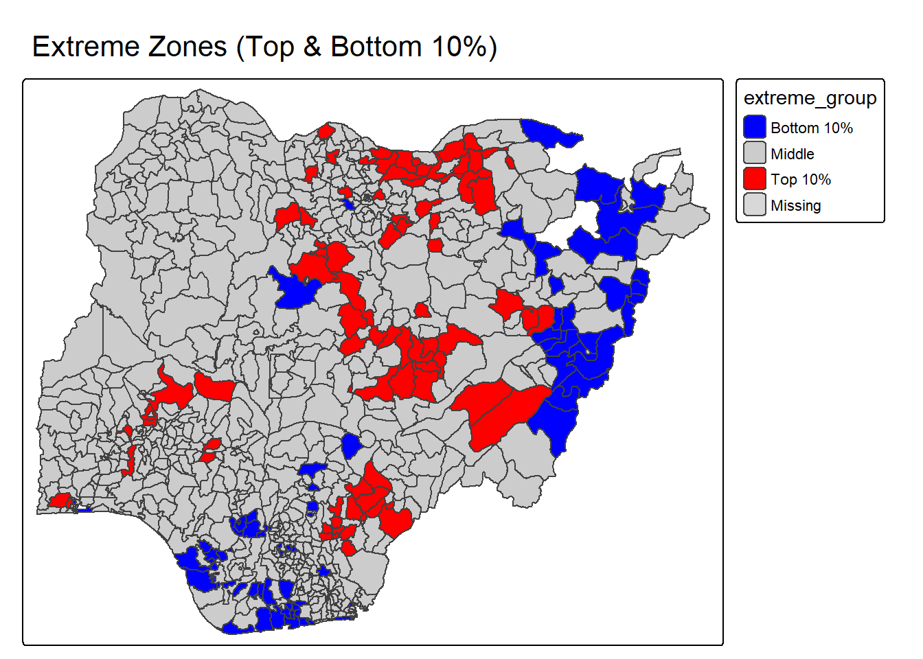
percentmap_binary_extreme <- function(vnam, df){

  var <- get.var(vnam, df)

  q90 <- quantile(var, 0.9)
  q10 <- quantile(var, 0.1)

  df$extreme_group <- "Middle"
  df$extreme_group[df[[vnam]] >= q90] <- "Top 10%"
  df$extreme_group[df[[vnam]] <= q10] <- "Bottom 10%"

  tm_shape(df) +
    tm_polygons("extreme_group",
      palette=c("Top 10%"="red",
                "Middle"="grey80",
                "Bottom 10%"="blue")
    ) +
    tm_borders() +
    tm_layout(main.title="Extreme Zones (Top & Bottom 10%)")
}

percentmap_binary_extreme("total_wp", NGA_wp)
2.3.2 Box map
In essence, a box map is an augmented quartile map, with an additional lower and upper category. When there are lower outliers, then the starting point for the breaks is the minimum value, and the second break is the lower fence. In contrast, when there are no lower outliers, then the starting point for the breaks will be the lower fence, and the second break is the minimum value (there will be no observations that fall in the interval between the lower fence and the minimum value).
ggplot(data = NGA_wp,
       aes(x = "",
           y = wp_nonfunctional)) +
  geom_boxplot()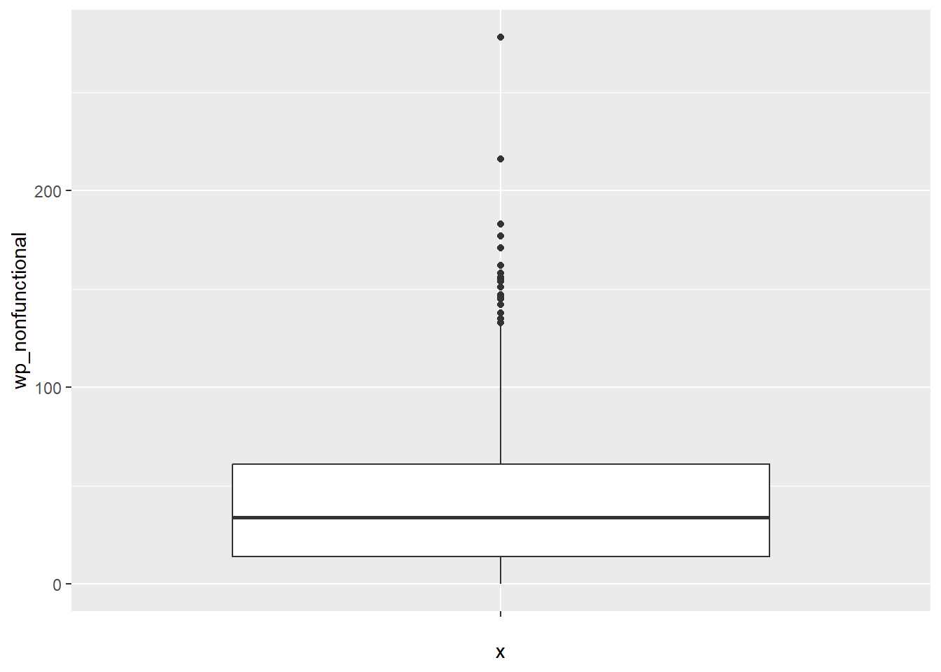
Displaying summary statistics on a choropleth map by using the basic principles of boxplot.
To create a box map, a custom breaks specification will be used. However, there is a complication. The break points for the box map vary depending on whether lower or upper outliers are present.
2.3.2.1 Creating the boxbreaks function
The code chunk below is an R function that creating break points for a box map.
- arguments:
- v: vector with observations
- mult: multiplier for IQR (default 1.5)
- returns:
- bb: vector with 7 break points compute quartile and fences
boxbreaks <- function(v,mult=1.5) {
  qv <- unname(quantile(v))
  iqr <- qv[4] - qv[2]
  upfence <- qv[4] + mult * iqr
  lofence <- qv[2] - mult * iqr
  # initialize break points vector
  bb <- vector(mode="numeric",length=7)
  # logic for lower and upper fences
  if (lofence < qv[1]) {  # no lower outliers
    bb[1] <- lofence
    bb[2] <- floor(qv[1])
  } else {
    bb[2] <- lofence
    bb[1] <- qv[1]
  }
  if (upfence > qv[5]) { # no upper outliers
    bb[7] <- upfence
    bb[6] <- ceiling(qv[5])
  } else {
    bb[6] <- upfence
    bb[7] <- qv[5]
  }
  bb[3:5] <- qv[2:4]
  return(bb)
}
2.3.2.2 Creating the get.var function
The code chunk below is an R function to extract a variable as a vector out of an sf data frame.
- arguments:
- vname: variable name (as character, in quotes)
- df: name of sf data frame
- returns:
- v: vector with values (without a column name)
get.var <- function(vname,df) {
  v <- df[vname] %>% st_set_geometry(NULL)
  v <- unname(v[,1])
  return(v)
}
2.3.2.3 Test drive the newly created function
var <- get.var("wp_nonfunctional", NGA_wp)
boxbreaks(var)
[1] -56.5 0.0 14.0 34.0 61.0 131.5 278.02.3.2.4 Boxmap function
The code chunk below is an R function to create a box map. - arguments: - vnam: variable name (as character, in quotes) - df: simple features polygon layer - legtitle: legend title - mtitle: map title - mult: multiplier for IQR - returns: - a tmap-element (plots a map)
boxmap <- function(vnam, df,
                   legtitle=NA,
                   mtitle="Box Map",
                   mult=1.5){
  var <- get.var(vnam,df)
  bb <- boxbreaks(var)
  tm_shape(df) +
    tm_polygons() +
  tm_shape(df) +
     tm_fill(vnam,title=legtitle,
             breaks=bb,
             palette="Blues",
          labels = c("lower outlier",
                     "< 25%",
                     "25% - 50%",
                     "50% - 75%",
                     "> 75%",
                     "upper outlier"))  +
  tm_borders() +
  tm_layout(main.title = mtitle,
            title.position = c("left",
                               "top"))
}tmap_mode("plot")
boxmap("wp_nonfunctional", NGA_wp)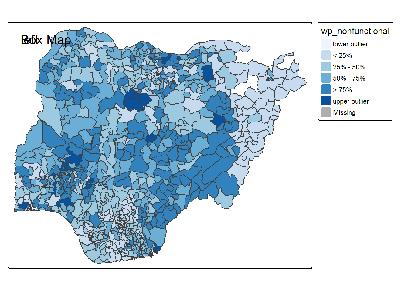
2.3.2.5 Outlier Highlight Map
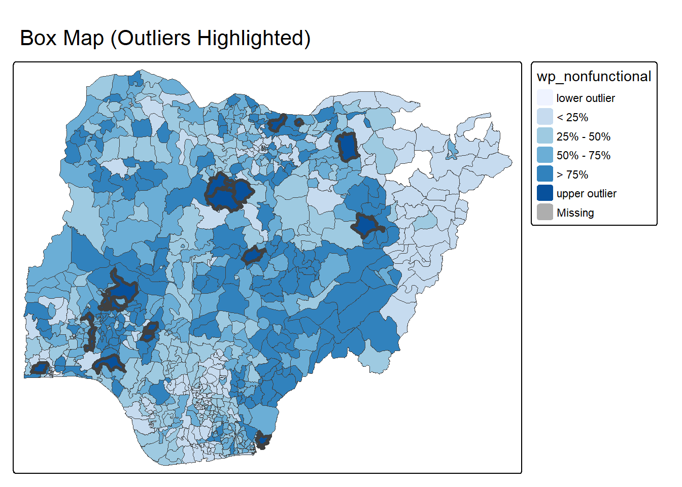
boxmap_highlight_outliers <- function(vnam, df,
                                      legtitle = vnam,
                                      mtitle = "Box Map (Outliers Highlighted)",
                                      mult = 1.5){

  var <- get.var(vnam, df)
  bb <- boxbreaks(var, mult = mult)

  qv <- unname(quantile(var))
  iqr <- qv[4] - qv[2]
  upfence <- qv[4] + mult * iqr
  lofence <- qv[2] - mult * iqr

  df2 <- df
  df2$upper_outlier <- df2[[vnam]] > upfence
  df2$lower_outlier <- df2[[vnam]] < lofence

  p <- tm_shape(df2) +
        tm_fill(vnam,
                title = legtitle,
                breaks = bb,
                palette = "Blues",
                labels = c("lower outlier",
                           "< 25%",
                           "25% - 50%",
                           "50% - 75%",
                           "> 75%",
                           "upper outlier")) +
        tm_borders(lwd = 0.5)

  if (any(df2$upper_outlier)) {
    p <- p +
      tm_shape(df2[df2$upper_outlier, ]) +
      tm_borders(lwd = 3)
  }

  if (any(df2$lower_outlier)) {
    p <- p +
      tm_shape(df2[df2$lower_outlier, ]) +
      tm_borders(lwd = 3, col = "red")
  }

  p + tm_layout(main.title = mtitle,
                legend.outside = TRUE)
}

boxmap_highlight_outliers("wp_nonfunctional", NGA_wp)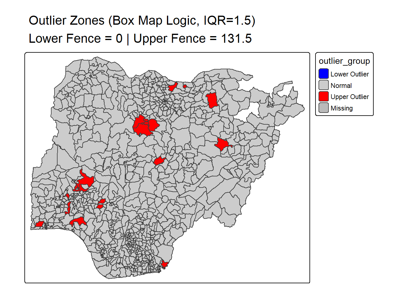
boxmap_outlier_zones_from_bb <- function(vnam, df, mult = 1.5){

  var <- get.var(vnam, df)

  bb <- boxbreaks(var, mult = mult)

  lofence <- bb[2]
  upfence <- bb[6]

  df2 <- df
  df2$outlier_group <- "Normal"
  df2$outlier_group[df2[[vnam]] < lofence] <- "Lower Outlier"
  df2$outlier_group[df2[[vnam]] > upfence] <- "Upper Outlier"

  df2$outlier_group <- factor(df2$outlier_group,
                              levels = c("Lower Outlier", "Normal", "Upper Outlier"))

  tm_shape(df2) +
    tm_polygons(
      "outlier_group",
      palette = c("Lower Outlier"="blue",
                  "Normal"="grey80",
                  "Upper Outlier"="red"),
      drop.levels = FALSE
    ) +
    tm_borders() +
    tm_layout(
      main.title = paste0(
        "Outlier Zones (Box Map Logic, IQR=", mult, ")\n",
        "Lower Fence = ", round(lofence, 1),
        " | Upper Fence = ", round(upfence, 1)
      ),
      legend.outside = TRUE
    )
}

boxmap_outlier_zones_from_bb("wp_nonfunctional", NGA_wp)