pacman::p_load(
pacman, tidyverse, lubridate, cluster, factoextra, DT, shiny, plotly,e1071,h2o,mclust,parallelPlot
)Take-home Exercise 2 – Clustering Module Prototype
Overview
This take-home exercise develops a prototype of the Customer Segmentation Module for the final Shiny application.
The dataset is already structured at the customer level, meaning each row represents a unique customer with demographic, behavioural, engagement, and satisfaction attributes. Therefore, no transaction-level aggregation is required.
The purpose of this prototype is to:
Feature engineering from transaction-level data
Feasibility of k-means clustering
Interactive parameters (k and variable selection)
Visual outputs for cluster exploration
1 Getting Started
1.1 Installing and loading the packages
Before performing analysis, the required packages are loaded. These packages support data manipulation, clustering evaluation, and visualisation.
| Library | Description |
|---|---|
| pacman | Install and load multiple packages in one command. |
| tidyverse | Data wrangling + ggplot2 visualization workflow . |
| lubridate | Date parsing and date arithmetic. |
| cluster | Clustering evaluation utilities (e.g., silhouette). |
| factoextra | Helper functions for visualising clusters and PCA results . |
| DT | Interactive tables for cluster profile summaries in Shiny. |
| shiny | UI and server framework for integrating this module into the final Shiny app. |
| plotly | Interactive plotting for cluster maps and exploratory visuals. |
| e1071 | Skewness computation. |
2 Data Preparation
2.1 Loading the Dataset
We first import the customer-level dataset and inspect its structure to confirm variable types.
customers <- read_csv("data/customer_data.csv")
glimpse(customers)Rows: 48,723
Columns: 54
$ customer_id <dbl> 93716481, 49020929, 52690950, 23199751, 619…
$ age <dbl> 44, 44, 45, 45, 44, 45, 44, 44, 45, 44, 44,…
$ gender <chr> "Male", "Male", "Male", "Male", "Female", "…
$ location <chr> "Pereira, Risaralda", "Cali, Valle del Cauc…
$ income_bracket <chr> "Very High", "Medium", "High", "High", "Med…
$ occupation <chr> "Engineer", "Construction Worker", "Constru…
$ education_level <chr> "Master", "Bachelor", "Bachelor", "High Sch…
$ marital_status <chr> "Married", "Married", "Married", "Single", …
$ household_size <dbl> 5, 2, 4, 2, 3, 4, 4, 3, 1, 3, 5, 3, 3, 7, 3…
$ acquisition_channel <chr> "Partnership", "Paid Ad", "Paid Ad", "Refer…
$ customer_segment <chr> "occasional", "regular", "inactive", "inact…
$ savings_account <lgl> TRUE, TRUE, TRUE, TRUE, TRUE, TRUE, TRUE, T…
$ credit_card <lgl> TRUE, FALSE, FALSE, FALSE, TRUE, TRUE, TRUE…
$ personal_loan <lgl> FALSE, FALSE, FALSE, FALSE, FALSE, FALSE, F…
$ investment_account <lgl> FALSE, FALSE, TRUE, TRUE, FALSE, TRUE, FALS…
$ insurance_product <lgl> TRUE, FALSE, TRUE, FALSE, FALSE, FALSE, FAL…
$ active_products <dbl> 1, 5, 3, 2, 1, 1, 1, 4, 2, 3, 1, 5, 3, 1, 1…
$ app_logins_frequency <dbl> 15, 30, 4, 15, 19, 15, 44, 22, 7, 11, 7, 30…
$ feature_usage_diversity <dbl> 3, 0, 4, 4, 1, 4, 6, 1, 1, 6, 3, 1, 2, 1, 3…
$ bill_payment_user <lgl> FALSE, TRUE, TRUE, TRUE, FALSE, TRUE, TRUE,…
$ auto_savings_enabled <lgl> FALSE, FALSE, FALSE, FALSE, FALSE, TRUE, FA…
$ credit_utilization_ratio <dbl> 0.17871029, NA, NA, NA, 0.40360553, 0.07786…
$ international_transactions <dbl> 1, 1, 1, 1, 0, 0, 0, 0, 0, 1, 0, 0, 0, 1, 0…
$ failed_transactions <dbl> 0, 0, 0, 1, 0, 0, 1, 1, 0, 0, 1, 0, 0, 1, 0…
$ tx_count <dbl> 76, 10, 10, 23, 18, 15, 24, 45, 134, 13, 18…
$ avg_tx_value <dbl> 1679872.4, 5445810.0, 640335.0, 660180.4, 1…
$ total_tx_volume <dbl> 127670300, 54458100, 6403350, 15184150, 262…
$ first_tx <date> 2023-01-05, 2023-02-05, 2023-01-31, 2023-0…
$ last_tx <date> 2023-12-25, 2023-12-20, 2023-12-12, 2023-1…
$ base_satisfaction <dbl> 9.213372, 6.073093, 8.198643, 7.529577, 6.6…
$ tx_satisfaction <dbl> 0.380, 0.050, 0.050, 0.115, 0.090, 0.075, 0…
$ product_satisfaction <dbl> 0.6, 0.2, 0.6, 0.4, 0.4, 0.6, 0.4, 0.4, 0.6…
$ satisfaction_score <dbl> 5, 3, 4, 4, 3, 4, 4, 4, 5, 4, 4, 5, 4, 3, 4…
$ nps_score <dbl> -7, -46, -29, -31, -47, -29, -34, -36, -4, …
$ last_survey_date <date> 2023-12-16, 2023-05-05, 2023-11-16, 2023-0…
$ support_tickets_count <dbl> 1, 1, 0, 2, 2, 1, 1, 0, 2, 0, 0, 2, 3, 1, 0…
$ resolved_tickets_ratio <dbl> 0.0000000, 1.0000000, 0.0000000, 0.5000000,…
$ app_store_rating <dbl> 3.5, 4.0, 5.0, 4.5, 4.0, 4.0, 5.0, 4.5, 4.5…
$ feedback_sentiment <chr> "Neutral", "Positive", "Positive", "Positiv…
$ feature_requests <chr> "Budgeting tools", NA, NA, "Cryptocurrency …
$ complaint_topics <chr> NA, NA, NA, NA, "App performance", NA, NA, …
$ clv_segment <chr> "Gold", "Bronze", "Gold", "Bronze", "Gold",…
$ monthly_transaction_count <dbl> 1.428571, 1.571429, 2.500000, 1.555556, 2.1…
$ average_transaction_value <dbl> 6054025.0, 2127413.6, 3575915.0, 1513353.6,…
$ total_transaction_volume <dbl> 60540250, 23401550, 35759150, 21186950, 116…
$ transaction_frequency <dbl> 0.03076923, 0.03293413, 0.05000000, 0.04778…
$ last_transaction_date <date> 2023-12-05, 2023-12-18, 2023-10-27, 2023-1…
$ preferred_transaction_type <chr> "Transfer", "Transfer", "Transfer", "Transf…
$ first_transaction_date <date> 2023-01-05, 2023-02-05, 2023-01-31, 2023-0…
$ weekend_transaction_ratio <dbl> 0.30000000, 0.18181818, 0.30000000, 0.14285…
$ avg_daily_transactions <dbl> 0.03076923, 0.03293413, 0.05000000, 0.04778…
$ customer_tenure <dbl> 11.633333, 11.500000, 8.766667, 10.733333, …
$ churn_probability <dbl> 0.3622688, 0.1817896, 0.3212651, 0.3366287,…
$ customer_lifetime_value <dbl> 312414808, 167022286, 19403711, 35978105, 3…2.2 Data Integrity Checks
2.2.1 Missing Values
Missing values may distort clustering results. Therefore, we inspect NA counts.
customers %>%
summarise(across(everything(), ~sum(is.na(.))))# A tibble: 1 × 54
customer_id age gender location income_bracket occupation education_level
<int> <int> <int> <int> <int> <int> <int>
1 0 0 0 0 0 0 0
# ℹ 47 more variables: marital_status <int>, household_size <int>,
# acquisition_channel <int>, customer_segment <int>, savings_account <int>,
# credit_card <int>, personal_loan <int>, investment_account <int>,
# insurance_product <int>, active_products <int>, app_logins_frequency <int>,
# feature_usage_diversity <int>, bill_payment_user <int>,
# auto_savings_enabled <int>, credit_utilization_ratio <int>,
# international_transactions <int>, failed_transactions <int>, …The missing value inspection shows that all 54 variables contain zero missing entries.
This indicates that the dataset is fully observed at the customer level. No imputation or row removal procedures are required.
2.2.2 Duplicate Records
Since clustering is performed at the customer level, duplicate rows would bias the segmentation.
sum(duplicated(customers))[1] 0The result indicates that no duplicate rows exist, confirming dataset integrity.
3 Variable Selection for Clustering
Clustering should rely on behavioural and engagement signals, rather than identifiers or pre-existing labels.
The following variables are selected:
cluster_vars <- c(
"monthly_transaction_count",
"average_transaction_value",
"total_transaction_volume",
"transaction_frequency",
"avg_daily_transactions",
"app_logins_frequency",
"feature_usage_diversity",
"active_products",
"weekend_transaction_ratio",
"customer_tenure"
)These variables capture:
- Transaction intensity
- Spending behaviour
- App engagement
- Product breadth
- Customer tenure
4 Preprocessing
Clustering results can be strongly affected by variable scale, skewness, and redundancy among features. This applies not only to K-means, but also to other clustering methods such as PAM and Gaussian Mixture Models (GMM). Therefore, preprocessing is essential to ensure fair comparison across clustering approaches.
The preprocessing pipeline follows three steps:
- Preserve original data for interpretation
- Apply transformation to highly skewed variables
- Standardise variables before clustering
4.1 Create Original Dataset
Before transformation, we preserve the original numeric values. This dataset will later be used to compute cluster profile summaries.
df_original <- customers %>%
dplyr::select(customer_id, dplyr::all_of(cluster_vars)) %>%
dplyr::mutate(
dplyr::across(
dplyr::all_of(cluster_vars),
~ readr::parse_number(as.character(.))
)
)
# Audit NA introduced by parsing
na_after_parse <- df_original %>%
dplyr::summarise(dplyr::across(dplyr::all_of(cluster_vars), ~ sum(is.na(.)))) %>%
tidyr::pivot_longer(dplyr::everything(), names_to = "variable", values_to = "na_n") %>%
dplyr::arrange(dplyr::desc(na_n))
na_after_parse# A tibble: 10 × 2
variable na_n
<chr> <int>
1 monthly_transaction_count 0
2 average_transaction_value 0
3 total_transaction_volume 0
4 transaction_frequency 0
5 avg_daily_transactions 0
6 app_logins_frequency 0
7 feature_usage_diversity 0
8 active_products 0
9 weekend_transaction_ratio 0
10 customer_tenure 0# Keep complete cases for clustering variables
df_original_cc <- df_original %>%
dplyr::filter(dplyr::if_all(dplyr::all_of(cluster_vars), ~ !is.na(.)))
# Quick sanity check
tibble::tibble(
total_rows = nrow(df_original),
rows_used_for_clustering = nrow(df_original_cc),
rows_removed = nrow(df_original) - nrow(df_original_cc)
)# A tibble: 1 × 3
total_rows rows_used_for_clustering rows_removed
<int> <int> <int>
1 48723 48723 04.2 Correlation Analysis
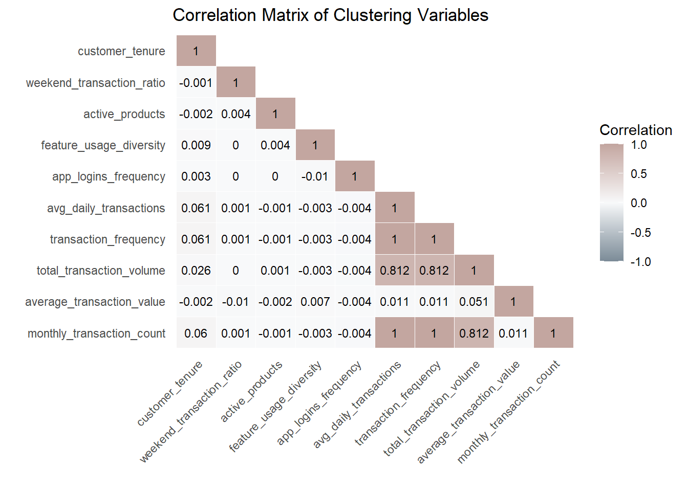
Before proceeding with clustering, it is crucial to check for multicollinearity among the selected variables. Highly correlated variables can distort clustering by disproportionately weighting similar information, especially in distance-based methods such as K-means and PAM, and may also reduce interpretability in model-based clustering such as GMM.
We compute the Pearson correlation matrix and visualise it using a lower triangular heatmap.
Code
cor_matrix <- cor(df_original_cc %>% select(all_of(cluster_vars)),
use = "pairwise.complete.obs")
cor_matrix[upper.tri(cor_matrix, diag = FALSE)] <- NA
cor_long <- as.data.frame(as.table(cor_matrix)) %>%
rename(Variable1 = Var1, Variable2 = Var2, Correlation = Freq) %>%
drop_na()
var_order <- colnames(cor_matrix)
cor_long$Variable1 <- factor(cor_long$Variable1, levels = rev(var_order))
cor_long$Variable2 <- factor(cor_long$Variable2, levels = var_order)
ggplot(cor_long, aes(Variable1, Variable2, fill = Correlation)) +
geom_tile(color = "white") +
scale_fill_gradient2(
low = "#7B8B97",
mid = "#F8F9FA",
high = "#C3A6A0",
midpoint = 0,
limits = c(-1, 1),
name = "Correlation"
) +
geom_text(aes(label = round(Correlation, 3)), color = "black", size = 3) +
labs(
title = "Correlation Matrix of Clustering Variables",
x = "", y = ""
) +
theme_minimal() +
theme(
axis.text.x = element_text(angle = 45, hjust = 1),
panel.grid.major = element_blank()
)
Note
Shiny design note (feature selection guardrail).
In the final Shiny application, users will be allowed to select clustering variables interactively. To mitigate redundancy and distance domination in K-means, the app will automatically compute the correlation matrix for the selected variables and flag highly correlated pairs (e.g., |r| ≥ 0.8). When such cases occur, the interface will display a warning and recommend selecting only one representative variable from each highly correlated group. This guardrail improves interpretability and helps maintain balanced distance contributions across features.
4.3 Skewness Assessment
Before applying log transformation, we quantify skewness to determine whether transformation is necessary.
skew_table <- df_original_cc %>%
dplyr::summarise(
dplyr::across(
dplyr::all_of(cluster_vars),
~ e1071::skewness(., na.rm = TRUE)
)
) %>%
tidyr::pivot_longer(dplyr::everything(), names_to = "variable", values_to = "skewness") %>%
dplyr::arrange(dplyr::desc(abs(skewness)))
skew_table# A tibble: 10 × 2
variable skewness
<chr> <dbl>
1 total_transaction_volume 129.
2 monthly_transaction_count 63.5
3 transaction_frequency 63.4
4 avg_daily_transactions 63.4
5 average_transaction_value 2.25
6 customer_tenure -2.24
7 app_logins_frequency 0.925
8 active_products 0.912
9 feature_usage_diversity 0.556
10 weekend_transaction_ratio 0.2914.4 Interpretation & Log Transformation
Variables with absolute skewness > 1 are considered highly skewed and candidates for log transformation. We apply log1p(x) (log(1 + x)) to safely handle zero values.
skew_vars <- skew_table %>%
dplyr::filter(abs(skewness) > 1) %>%
dplyr::pull(variable)
skew_vars[1] "total_transaction_volume" "monthly_transaction_count"
[3] "transaction_frequency" "avg_daily_transactions"
[5] "average_transaction_value" "customer_tenure" df_model <- df_original_cc %>%
mutate(across(all_of(skew_vars), ~ sign(.) * log1p(abs(.))))4.5 Skewness Comparison
To validate the effectiveness of transformation, we recompute skewness after applying log transformation.
skew_after <- df_model %>%
dplyr::summarise(
dplyr::across(
dplyr::all_of(cluster_vars),
~ e1071::skewness(., na.rm = TRUE)
)
) %>%
tidyr::pivot_longer(dplyr::everything(), names_to = "variable", values_to = "skew_after")
skew_compare <- skew_table %>%
dplyr::left_join(skew_after, by = "variable") %>%
dplyr::mutate(skew_reduction = abs(skewness) - abs(skew_after)) %>%
dplyr::arrange(dplyr::desc(skew_reduction))
skew_compare# A tibble: 10 × 4
variable skewness skew_after skew_reduction
<chr> <dbl> <dbl> <dbl>
1 total_transaction_volume 129. 0.711 128.
2 monthly_transaction_count 63.5 3.12 60.4
3 transaction_frequency 63.4 8.42 55.0
4 avg_daily_transactions 63.4 8.42 55.0
5 average_transaction_value 2.25 0.235 2.01
6 app_logins_frequency 0.925 0.925 0
7 active_products 0.912 0.912 0
8 feature_usage_diversity 0.556 0.556 0
9 weekend_transaction_ratio 0.291 0.291 0
10 customer_tenure -2.24 -2.69 -0.449This confirms that transformation improved distribution symmetry without over-transforming already well-behaved variables.
4.6 Standardisation
K-means clustering relies on Euclidean distance, which is sensitive to variable scale. We apply z-score scaling to prevent variables with larger magnitude from dominating distance computation.
X <- df_model %>%
dplyr::select(dplyr::all_of(cluster_vars)) %>%
as.matrix()
sds <- apply(X, 2, sd, na.rm = TRUE)
keep_cols <- is.finite(sds) & sds > 0
X <- X[, keep_cols, drop = FALSE]
good_rows <- apply(X, 1, function(r) all(is.finite(r)))
X <- X[good_rows, , drop = FALSE]
df_id <- df_model %>%
dplyr::select(customer_id) %>%
dplyr::slice(which(good_rows))
df_scaled <- scale(X)
stopifnot(all(is.finite(df_scaled)))5 Clustering Methods and Prototype Workflow
This prototype is designed to support multiple clustering methods so that users can compare segmentation outcomes under different algorithmic assumptions.
Three clustering methods are included:
- K-means: centroid-based baseline
- CLARA: medoid-based robust alternative
- GMM: model-based probabilistic alternative
This design is motivated by the fact that some behavioural variables remain highly skewed even after log transformation, and different clustering methods may respond differently to skewness, outliers, and cluster shape assumptions.
Note
In the final Shiny app, users will be able to adjust k and select variables. This prototype demonstrates the computation workflow and the planned output components.
5.1 K-means
K-means is used as the baseline clustering method because it is computationally efficient, widely interpretable, and integrates well with Shiny-based interactive analysis.
For full-data model selection, we use H2O K-means to evaluate candidate k values on the complete standardised matrix. H2O exposes metrics such as total within-cluster sum of squares and between-cluster sum of squares for scalable K-means training.
5.1.1 Full-data K selection with H2O
# Initialise H2O
h2o::h2o.init(nthreads = -1) Connection successful!
R is connected to the H2O cluster:
H2O cluster uptime: 43 minutes 1 seconds
H2O cluster timezone: +08:00
H2O data parsing timezone: UTC
H2O cluster version: 3.44.0.3
H2O cluster version age: 2 years, 2 months and 22 days
H2O cluster name: H2O_started_from_R_88696_gxb127
H2O cluster total nodes: 1
H2O cluster total memory: 7.03 GB
H2O cluster total cores: 22
H2O cluster allowed cores: 22
H2O cluster healthy: TRUE
H2O Connection ip: localhost
H2O Connection port: 54321
H2O Connection proxy: NA
H2O Internal Security: FALSE
R Version: R version 4.5.2 (2025-10-31 ucrt) h2o::h2o.no_progress()
# Convert the full scaled matrix into an H2OFrame
h2o_X <- as.h2o(as.data.frame(df_scaled))
# Candidate k values
k_grid <- 2:15
# Run full-data H2O K-means across candidate k
k_results <- purrr::map_dfr(k_grid, function(k_val) {
km_h2o <- h2o::h2o.kmeans(
training_frame = h2o_X,
k = k_val,
standardize = FALSE, # already standardised in Section 4
seed = 2022
)
tot_withinss <- as.numeric(h2o::h2o.tot_withinss(km_h2o))
betweenss <- as.numeric(h2o::h2o.betweenss(km_h2o))
total_ss <- tot_withinss + betweenss
tibble(
k = k_val,
tot_withinss = tot_withinss,
betweenss = betweenss,
between_ratio = betweenss / total_ss
)
})
k_results# A tibble: 14 × 4
k tot_withinss betweenss between_ratio
<int> <dbl> <dbl> <dbl>
1 2 418557. 68663. 0.141
2 3 356549. 130671. 0.268
3 4 322464. 164756. 0.338
4 5 282413. 204807. 0.420
5 6 266338. 220882. 0.453
6 7 252747. 234473. 0.481
7 8 237643. 249577. 0.512
8 9 226425. 260795. 0.535
9 10 226874. 260346. 0.534
10 11 215418. 271802. 0.558
11 12 206827. 280393. 0.575
12 13 200207. 287013. 0.589
13 14 194943. 292277. 0.600
14 15 183908. 303312. 0.6235.1.2 Model Selection Metrics: Elbow (WSS)
Before choosing k, we inspect compactness using the Elbow Method.The metric used is Total Within-Cluster Sum of Squares (WSS). A sharp reduction followed by a flattening curve suggests diminishing returns.
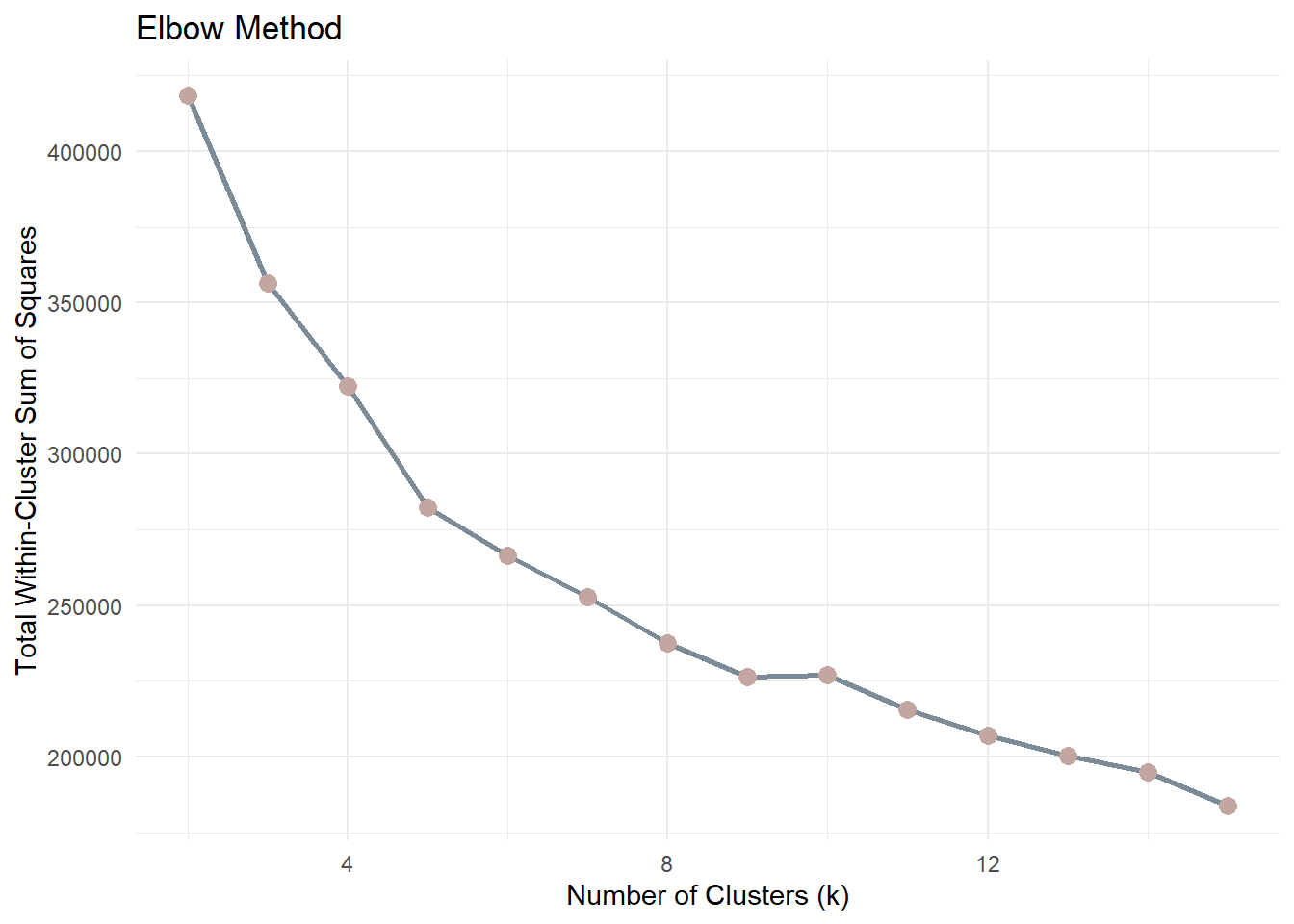
ggplot(k_results, aes(k, tot_withinss)) +
geom_line(color = "#7B8B97", linewidth = 1) +
geom_point(color = "#C3A6A0", size = 3) +
labs(
title = "Elbow Method",
x = "Number of Clusters (k)",
y = "Total Within-Cluster Sum of Squares"
) +
theme_minimal()
Note
As k increases, WSS will always decrease because more clusters reduce the distance between points and their assigned centroids. Therefore, the goal is not to minimise WSS but to identify the point where the rate of improvement slows down.
The “elbow” point represents a balance between model simplicity and cluster compactness. After this point, increasing the number of clusters yields diminishing returns in terms of improved cluster cohesion.
5.1.3 BetweenSS / TotalSS ratio
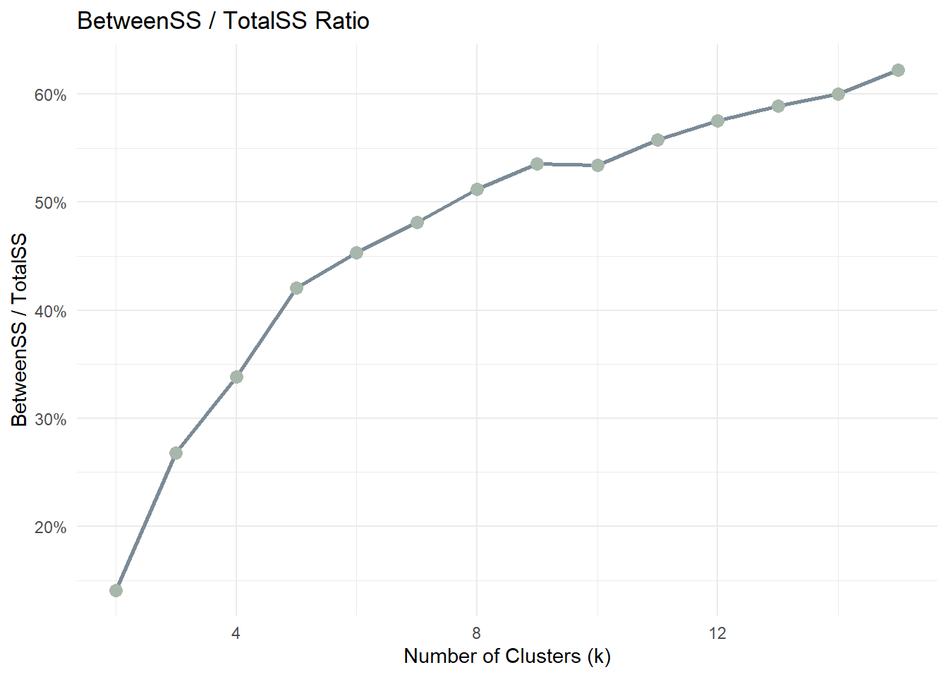
ggplot(k_results, aes(k, between_ratio)) +
geom_line(color = "#7B8B97", linewidth = 1) +
geom_point(color = "#A8B7AB", size = 3) +
scale_y_continuous(labels = scales::percent_format(accuracy = 1)) +
labs(
title = "BetweenSS / TotalSS Ratio",
x = "Number of Clusters (k)",
y = "BetweenSS / TotalSS"
) +
theme_minimal()
Note
This ratio measures how much of the total variance in the data is explained by the clustering structure. A higher ratio indicates that clusters are more clearly separated.
As k increases, the ratio typically increases but eventually stabilises. The optimal k is often found where the improvement becomes marginal.
5.2 CLARA
CLARA (Clustering Large Applications) is included as a large-data medoid-based alternative to K-means.
Compared with K-means, CLARA is less sensitive to extreme values because it is based on medoids rather than means. It is also more suitable than standard PAM when the dataset is large.
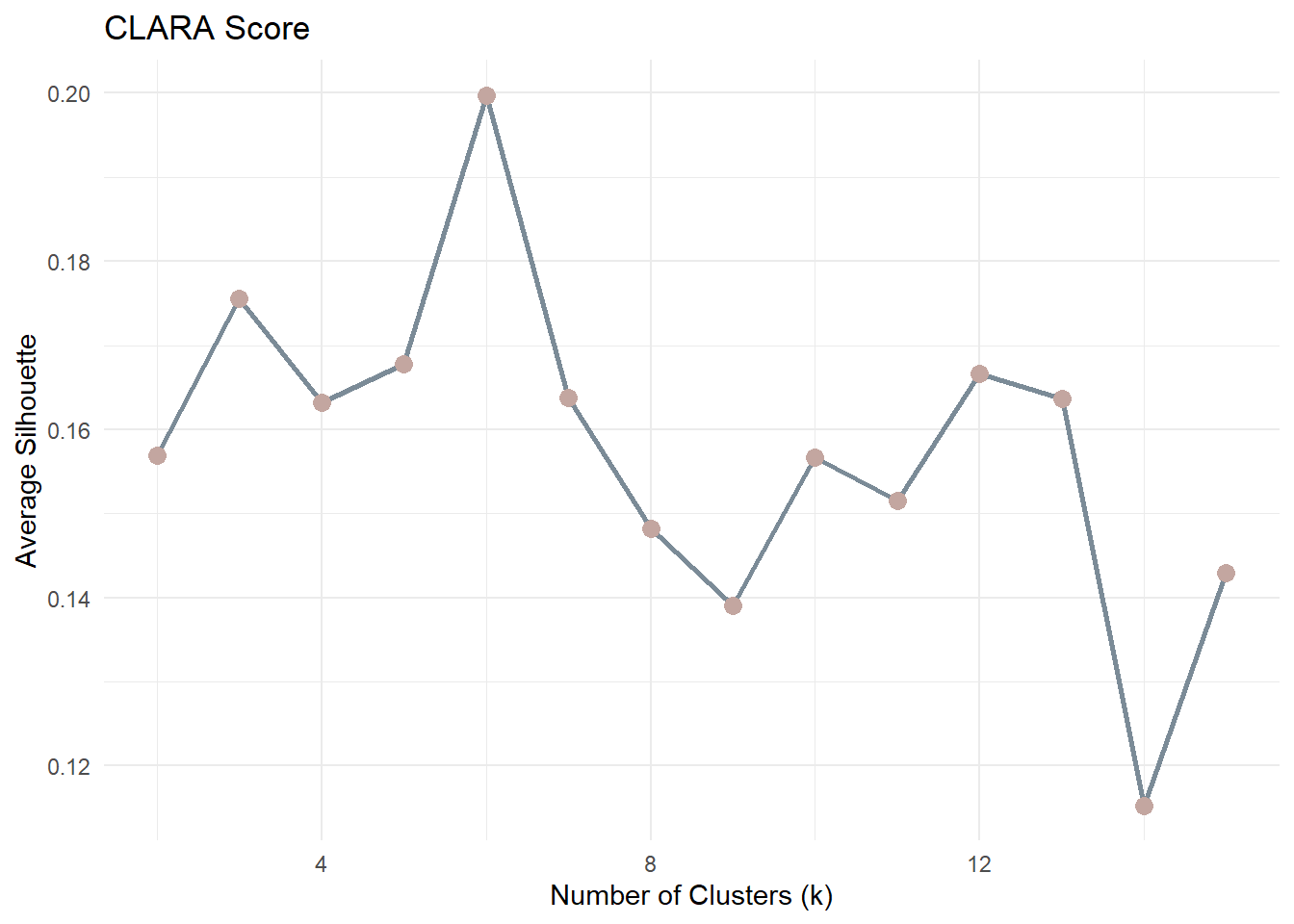
For CLARA, the most natural model-selection criterion is average silhouette width.
5.2.1 CLARA Model Selection
clara_results <- purrr::map_dfr(2:15, function(k_val) {
clara_fit <- cluster::clara(df_scaled, k = k_val, samples = 5)
tibble(
k = k_val,
avg_silhouette = clara_fit$silinfo$avg.width
)
})
clara_results# A tibble: 14 × 2
k avg_silhouette
<int> <dbl>
1 2 0.157
2 3 0.176
3 4 0.163
4 5 0.168
5 6 0.200
6 7 0.164
7 8 0.148
8 9 0.139
9 10 0.157
10 11 0.152
11 12 0.167
12 13 0.164
13 14 0.115
14 15 0.1435.2.2 CLARA Plot
ggplot(clara_results, aes(k, avg_silhouette)) +
geom_line(color = "#7B8B97", linewidth = 1) +
geom_point(color = "#C3A6A0", size = 3) +
labs(
title = "CLARA Score",
x = "Number of Clusters (k)",
y = "Average Silhouette"
) +
theme_minimal()
Note
For each observation, the silhouette value ranges from −1 to 1:
- Values close to 1 indicate well-separated clusters
- Values near 0 suggest overlapping clusters
- Negative values indicate potential misclassification
The average silhouette score across all observations is computed for each k. The optimal number of clusters is typically the value of k that maximises the average silhouette score.
5.3 GMM
Gaussian Mixture Models (GMM) are included as a model-based clustering alternative.
Unlike K-means and PAM, GMM does not assume spherical clusters and instead models the data as a mixture of Gaussian components. For GMM, model selection is based on BIC rather than elbow or silhouette.
5.3.1 GMM Fitting
gmm_fit <- mclust::Mclust(df_scaled, G = 2:15)
summary(gmm_fit)----------------------------------------------------
Gaussian finite mixture model fitted by EM algorithm
----------------------------------------------------
Mclust VVI (diagonal, varying volume and shape) model with 14 components:
log-likelihood n df BIC ICL
-283530.5 48723 293 -570223.6 -576822.7
Clustering table:
1 2 3 4 5 6 7 8 9 10 11 12 13 14
2822 5013 3580 3792 2813 2738 5214 4206 2614 3594 4970 3260 1402 2705 5.3.2 GMM BIC Plot
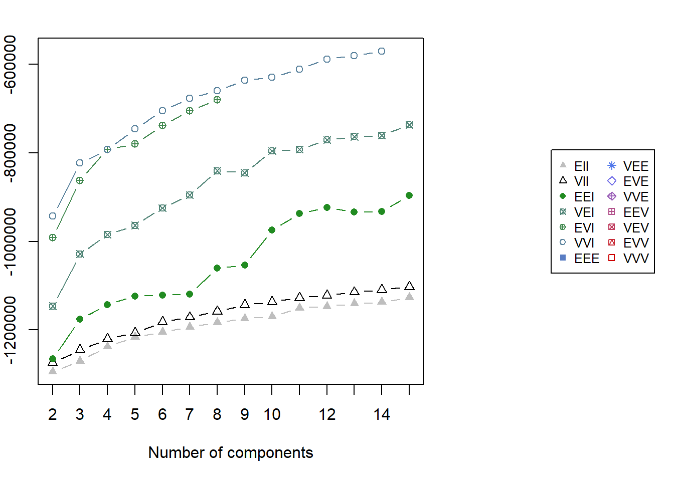
par(xpd = TRUE, mar = c(5, 4, 4, 13))
plot(gmm_fit, what = "BIC", legendArgs = list(x = "right", inset = c(-0.6, 0), cex = 0.8))
par(xpd = FALSE)5.4 Prototype Method for Demonstration
For the remainder of this prototype, one method is selected to demonstrate downstream visual outputs.
In the final Shiny implementation, users will be able to:
- choose the clustering method
- inspect the corresponding model-selection plot
- select the final number of clusters
- compare the resulting segmentation outputs
For consistency of explanation and ease of interpretation, the downstream prototype outputs below are demonstrated using K-means with k=2.
k_demo <- 2
method_demo <- "K-means"
set.seed(2022)
km <- kmeans(df_scaled, centers = k_demo, nstart = 50)
cluster_vector <- km$cluster
tibble(
method_demo = method_demo,
k_demo = k_demo,
n_clusters = length(unique(cluster_vector))
)# A tibble: 1 × 3
method_demo k_demo n_clusters
<chr> <dbl> <int>
1 K-means 2 26 Prototype Outputs for Shiny Integration
This section presents the common output panels that will be exposed in the final Shiny Customer Segmentation Module.
Regardless of the clustering method selected, the module will provide a consistent interpretation layer, including:
- cluster membership output
- cluster size distribution
- behavioural contrast
- key behavioural drivers
- demographic profiling
- variable-level distribution comparison
For demonstration purposes, the outputs below are generated using the selected prototype method stored in method_demo. In the final Shiny application, these panels will update dynamically according to the selected clustering algorithm.
6.1 Cluster Membership Output
Each customer included in the clustering workflow receives a cluster label. To keep the downstream analysis method-agnostic, cluster assignments are stored in a generic object cluster_vector.
Code
cluster_labels <- df_id %>%
mutate(cluster = factor(cluster_vector))
customers_labeled <- customers %>%
left_join(cluster_labels, by = "customer_id")
customers_clustered <- customers_labeled %>%
filter(!is.na(cluster))
tibble(
method_used = method_demo,
total_customers = nrow(customers_labeled),
clustered_customers = nrow(customers_clustered),
excluded_customers = nrow(customers_labeled) - nrow(customers_clustered)
)# A tibble: 1 × 4
method_used total_customers clustered_customers excluded_customers
<chr> <int> <int> <int>
1 K-means 48723 48723 06.2 Cluster Size Distribution
Cluster size reveals whether the selected method identifies balanced segments or a smaller niche group.
Code
cluster_size <- customers_clustered %>%
dplyr::count(cluster) %>%
dplyr::mutate(proportion = n / sum(n))
ggplot(cluster_size, aes(cluster, proportion, fill = cluster)) +
geom_col(show.legend = FALSE) +
scale_y_continuous(labels = scales::percent) +
scale_fill_manual(values = c("#9297A0", "#D4C5B9", "#A8B7AB", "#C3A6A0")) +
labs(
title = paste("Cluster Size Distribution -", method_demo),
x = "Cluster",
y = "Proportion of Customers"
) +
theme_minimal()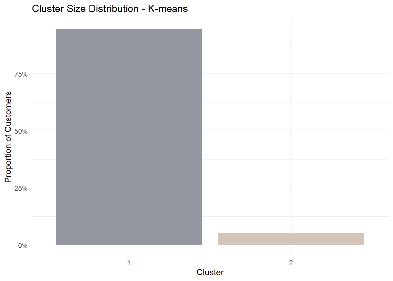
6.3 Behavioural Contrast
To understand how clusters differ behaviourally, we visualise the mean standardised profile of each cluster across the selected clustering variables.
This parallel coordinates plot shows the relative behavioural shape of each cluster rather than only the magnitude of difference.
Code
pp_data <- df_model %>%
dplyr::left_join(cluster_labels, by = "customer_id") %>%
dplyr::filter(!is.na(cluster)) %>%
dplyr::select(cluster, dplyr::all_of(cluster_vars))
histoVisibility <- names(pp_data)
parallelPlot::parallelPlot(
data = pp_data,
refColumnDim = "cluster",
rotateTitle = TRUE,
histoVisibility = histoVisibility
)6.4 Key Behavioural Drivers
To avoid subjective storytelling, we rank variables by the magnitude of difference between clusters.
Code
df_profile <- df_model %>%
dplyr::left_join(cluster_labels, by = "customer_id") %>%
dplyr::filter(!is.na(cluster))
cluster_means <- df_profile %>%
dplyr::group_by(cluster) %>%
dplyr::summarise(
dplyr::across(dplyr::all_of(cluster_vars), mean),
.groups = "drop"
)
diff_rank <- cluster_means %>%
tidyr::pivot_longer(
-cluster,
names_to = "variable",
values_to = "mean_value"
) %>%
tidyr::pivot_wider(
names_from = cluster,
values_from = mean_value
) %>%
dplyr::mutate(abs_diff = abs(`2` - `1`)) %>%
dplyr::arrange(dplyr::desc(abs_diff))
diff_rank %>% head(5)# A tibble: 5 × 4
variable `1` `2` abs_diff
<chr> <dbl> <dbl> <dbl>
1 total_transaction_volume 17.6 20.6 2.96
2 monthly_transaction_count 1.20 3.40 2.20
3 transaction_frequency 0.0760 0.762 0.686
4 avg_daily_transactions 0.0760 0.762 0.686
5 app_logins_frequency 22.4 22.5 0.1656.5 Demographic Profiling
Segmentation becomes more meaningful when linked back to customer characteristics.
For this prototype, we examine whether cluster membership differs by gender.
Code
gender_profile <- customers_clustered %>%
dplyr::group_by(cluster, gender) %>%
dplyr::summarise(n = dplyr::n(), .groups = "drop") %>%
dplyr::group_by(cluster) %>%
dplyr::mutate(prop = n / sum(n)) %>%
dplyr::ungroup()
ggplot(gender_profile, aes(cluster, prop, fill = gender)) +
geom_col(position = "fill") +
scale_y_continuous(labels = scales::percent) +
scale_fill_manual(values = c("#9297A0", "#D4C5B9", "#A8B7AB")) +
labs(
title = paste("Gender Composition by Cluster -", method_demo),
x = "Cluster",
y = "Proportion"
) +
theme_minimal()
6.6 Distribution Comparison
To further illustrate behavioural contrast, we visualise the top-ranked variable from the driver table.
Code
selected_var <- diff_rank$variable[1]
ggplot(customers_clustered,
aes(cluster, log1p(.data[[selected_var]]), fill = cluster)) +
geom_boxplot(show.legend = FALSE) +
scale_fill_manual(values = c("#A8B7AB", "#C3A6A0", "#9297A0", "#D4C5B9")) +
labs(
title = paste("Log Distribution of", selected_var, "-", method_demo),
x = "Cluster",
y = "log(1 + value)"
) +
theme_minimal()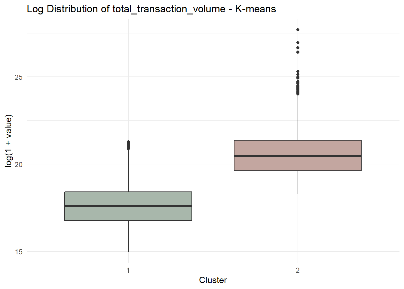
7 UI Design and Prototype Storyboard
This section presents the proposed interface design for the Customer Segmentation Module in the final Shiny application.
The purpose of this design is to translate the analytical workflow developed in this prototype into an interactive interface that allows users to explore customer segmentation results dynamically.
The interface is organised into a sequential workflow consisting of four main stages:
- Variable screening through correlation analysis
- Clustering method selection and model evaluation
- Cluster structure inspection
- Behavioural and demographic interpretation
Each stage exposes a small number of interactive parameters while presenting visual outputs that support interpretation of clustering results.
7.1 Interface Workflow Overview
| Step | Purpose | User Inputs | Visual Outputs |
|---|---|---|---|
| Step 1 | Variable screening | Variable selector | Correlation heatmap and correlation warning |
| Step 2 | Clustering method selection | Method selector | Model selection plots |
| Step 3 | Cluster structure inspection | k selector | Cluster size distribution |
| Step 4 | Behavioural comparison | None | Parallel coordinate plot |
| Step 5 | Interpretation | Demographic selector and variable selector | Demographic composition and distribution comparison |
7.2 Step 1 – Correlation Analysis
The first interface panel allows users to screen the selected clustering variables using a correlation matrix.
Highly correlated variables can distort distance-based clustering methods such as K-means and CLARA by over-weighting redundant information. Therefore, correlation inspection is provided as a preliminary diagnostic step.
Users can choose which variables to include in the clustering analysis. The system then computes the Pearson correlation matrix and visualises it as a heatmap.
If the absolute correlation between two variables exceeds a predefined threshold (e.g., |r| ≥ 0.8), the interface displays a warning message recommending that users retain only one variable from the correlated pair.
Code
knitr::include_graphics("image/Cluster.png")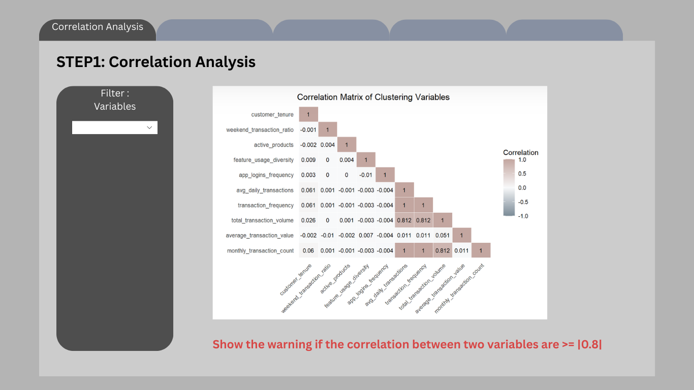
Interactive controls
- Variable selection dropdown
- Automatic correlation warning system
Outputs
- Correlation heatmap
- Correlation warning message
Planned Shiny components
selectInput()orpickerInput()for variable selectionplotOutput()for correlation heatmapuiOutput()for correlation warning
7.3 Step 2 – Clustering Method Selection
After selecting appropriate variables, users proceed to choose a clustering algorithm.
Three clustering methods are supported:
- K-means
- CLARA
- Gaussian Mixture Models (GMM)
For each method, a model selection plot is displayed to help users determine an appropriate number of clusters.
For example:
- K-means: Elbow plot and BetweenSS/TotalSS ratio
- CLARA: Average silhouette score
- GMM: Bayesian Information Criterion (BIC)
These plots help users identify a suitable cluster number before running the final segmentation.
Code
knitr::include_graphics("image/Cluster (2).png").png)
Interactive controls
- Clustering method selector
Outputs
- Model selection plots corresponding to the chosen method
Planned Shiny components
radioButtons()for clustering method selectionplotOutput()for model selection plots
7.4 Step 3 – Cluster Structure Inspection
Once the clustering method has been selected, users choose the number of clusters (k).
The interface then visualises the resulting cluster size distribution.
This step allows users to inspect whether clusters are reasonably balanced or whether the solution produces extremely small niche segments.
Code
knitr::include_graphics("image/Cluster (3).png").png)
Interactive controls
- Cluster number selector
Outputs
- Cluster size distribution bar chart
Planned Shiny components
sliderInput()orselectInput()for k selectionplotOutput()for cluster size visualisation
7.5 Step 4 – Behavioural Contrast
After cluster formation, the interface presents behavioural differences between clusters.
A parallel coordinates plot is used to visualise how clusters differ across multiple behavioural variables simultaneously.
This plot highlights the relative profile of each cluster rather than absolute magnitude, allowing users to identify distinct behavioural patterns.
Code
knitr::include_graphics("image/Cluster (4).png").png)
Outputs
- Parallel coordinates plot showing behavioural differences between clusters
Planned Shiny components
plotOutput()orplotlyOutput()for interactive parallel coordinates
7.6 Step 5 – Cluster Interpretation
The final panel focuses on interpreting clusters through demographic characteristics and variable distributions.
Users can explore how clusters differ across demographic variables such as gender, age group, or income category.
In addition, the interface allows users to examine distribution differences for selected behavioural variables.
Code
knitr::include_graphics("image/Cluster (5).png").png)
Interactive controls
- Demographic variable selector
- Behavioural variable selector
Outputs
- Demographic composition chart
- Distribution comparison plot
Planned Shiny components
selectInput()for demographic variable selectionselectInput()for variable distribution comparisonplotOutput()for visualisations