In-Class Exercise 02
Overview
This exercise focuses on the strategic selection of chart types and the enhancement of user interpretation through effective annotation. The goal is to move beyond mere data display to intentional “data storytelling.
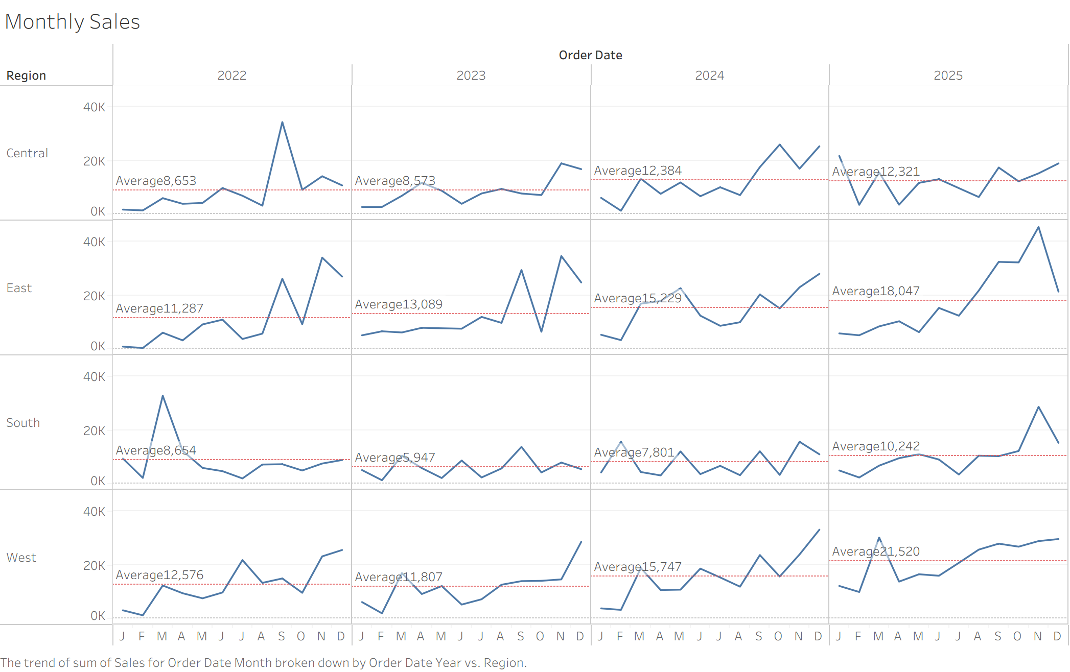
1. Monthly Sales with Reference Lines
Adding Reference Lines (e.g., average or target) provides a benchmark for the data. This allows analysts to instantly identify months with above-average performance, adding essential “context” to a standard line chart.
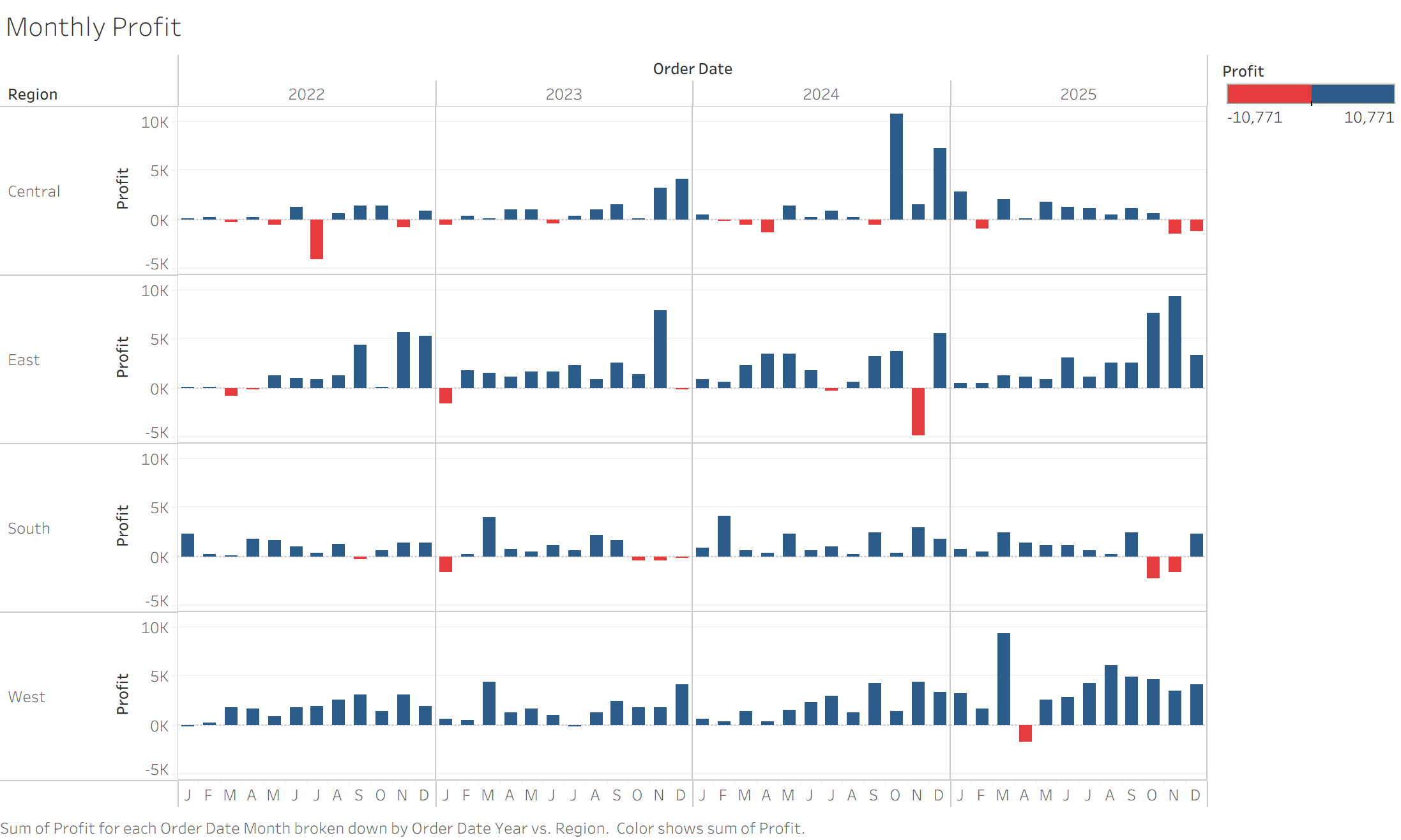
2. Monthly Profit (Bar Chart)
Switching to a bar chart for profit emphasizes divergence. By contrasting color and bar length, the intensity of profits and losses becomes much more visually impactful than a continuous line.
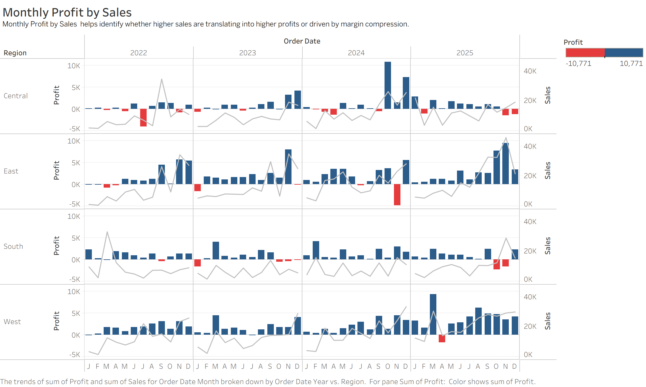
3. Relationship between Monthly Profit and Sales
This view explores correlation. Does high sales volume always translate to high profit? This helps identify months with “high revenue but low margin,” signaling a need for cost structure optimization.
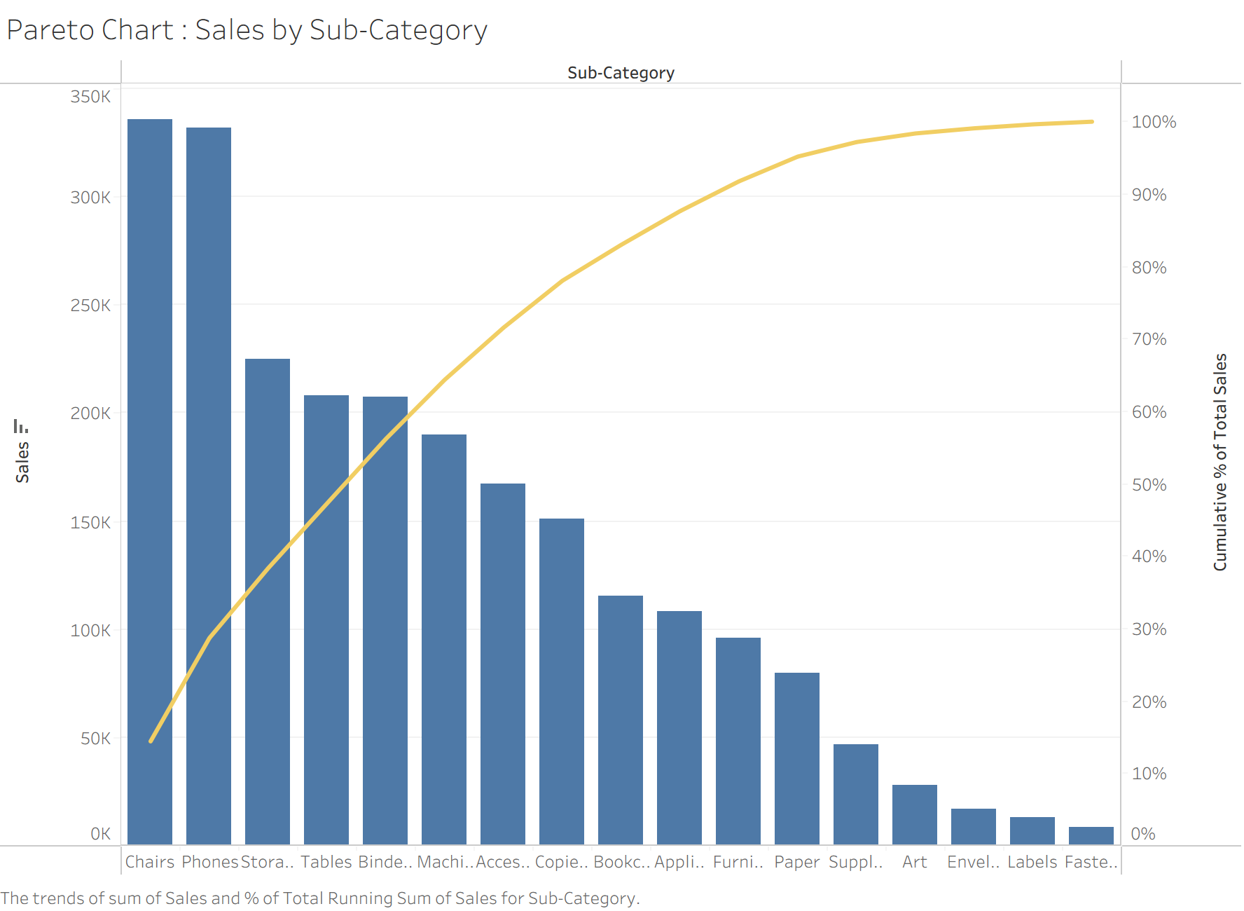
4. Pareto Chart: Sales by Sub-Category
This chart identifies the primary revenue drivers among sub-categories. It helps in optimizing the product mix, ensuring high-value categories receive adequate visibility and marketing budget.
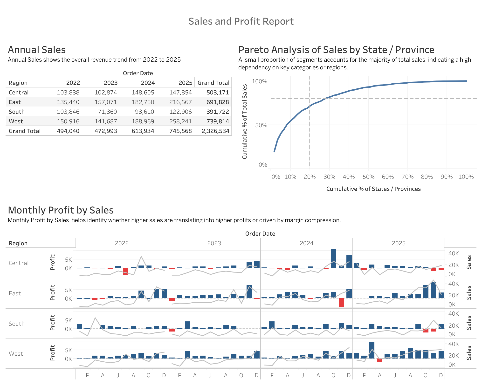
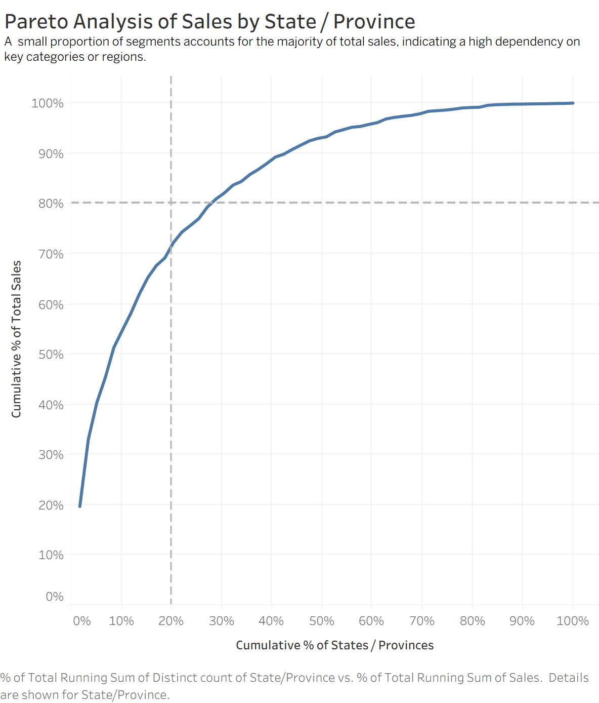
5. Pareto Analysis of Sales by State/Province
A classic application of the 80/20 Rule. It identifies the “vital few” states (top 20% of regions) that generate 80% of total sales. This is strategically crucial for resource allocation, such as the placement of logistics hubs and regional marketing expenditures.
6. Dashboard Presentation
Finally, we integrate these multi-dimensional views into a Dashboard. This provides a holistic perspective and utilizes interactivity to allow users to instantly identify the core regions and products driving the business.